
Ucharts Trading Charting Tool: A Complete Guide to Reading Market Charts
Every trading decision starts with a chart. Before you place an order, before you calculate risk, before you even decide whether a market is worth watching, you are looking at price plotted against time. The Ucharts trading charting tool was built to make that first step easier — turning raw price data into a visual story that traders of any experience level can actually read. This guide walks through how the tool works, how to interpret the charts it produces, and how to combine chart reading with sound risk management.
What Is the Ucharts Trading Charting Tool?
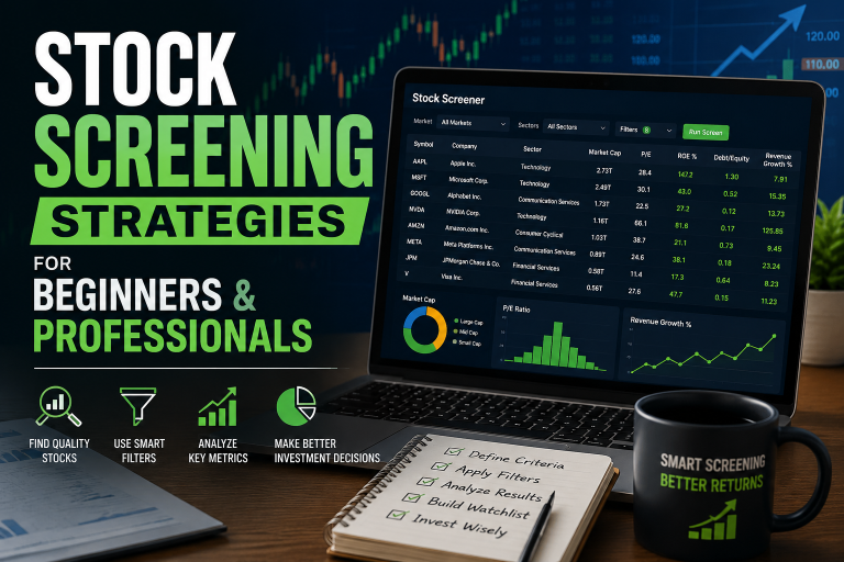
Ucharts is a browser-based charting and market-analysis platform designed for stocks, forex, metals, and crypto. Instead of forcing traders to juggle multiple tabs for price data, risk calculations, and trade planning, Ucharts brings these functions together in one interface. The goal is simple: help traders visualize price action clearly and make decisions based on structure, not guesswork.
Key Features of Ucharts
- Real-time price data for major stock symbols, forex pairs, metals, and crypto assets.
- Multiple chart types, including candlestick, line, and bar views.
- Cloud-synced settings, so your custom layouts follow you across devices.
- Built-in trade planning tools, including a position size calculator that pairs directly with your chart analysis.
- Clean, mobile-friendly design that works on modern browsers without extra downloads.
Whether you’re checking a daily candlestick pattern on a large-cap stock or watching an intraday move on a currency pair, the underlying skill is the same: reading what the chart is telling you about supply, demand, and momentum.
Why Chart Reading Matters for Traders
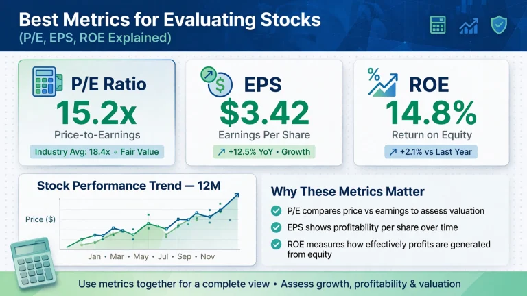
Fundamental data tells you what a company or economy is doing. A chart tells you what other traders are actually doing about it — where they are buying, where they are selling, and where they are hesitating. That’s why chart reading remains one of the core skills in technical analysis, regardless of which platform you use to view the data.
A trader who understands charts can answer three practical questions almost instantly: Is the market trending or ranging? Where is the nearest area of support or resistance? And does current price action support a trade idea, or contradict it? Ucharts is built to help you answer all three faster.
There’s also a psychological benefit to strong chart-reading skills. Markets move on emotion as much as on data, and a well-formed chart pattern is really a snapshot of collective trader psychology — fear at the bottom of a decline, greed near the top of a rally, hesitation at a well-tested resistance line. Learning to read a chart is, in many ways, learning to read the crowd. Traders who skip this step and rely purely on news headlines or tips often find themselves entering positions late, right as the “easy” move has already happened and momentum is fading.
This is precisely why Ucharts places chart visualization at the center of its platform rather than treating it as an afterthought bolted onto a data feed. A clean, responsive chart that updates in real time gives traders the confidence to act on what they see rather than second-guessing stale or cluttered data.
Understanding Candlestick Charts
The candlestick is the most widely used chart type on Ucharts and on most modern trading platforms. Each candle represents a fixed period of time — a minute, an hour, a day — and shows four data points: the open, the close, the high, and the low.
The “body” of the candle shows the range between the open and close, while the thin lines above and below (the “wicks” or “shadows”) show the extremes reached during that period. Traders often describe candlestick charts as a visual record of the tug-of-war between buyers and sellers, which makes them easier to interpret at a glance than raw numbers in a table.
Bullish vs. Bearish Candles
| Candle Type | What It Means | Typical Color |
|---|---|---|
| Bullish candle | Close is higher than open — buyers were in control | Green |
| Bearish candle | Close is lower than open — sellers were in control | Red |
| Doji | Open and close are nearly equal — indecision | Neutral |
Line Charts vs. Bar Charts vs. Candlestick Charts
Ucharts lets traders switch between chart types depending on what they need to see:
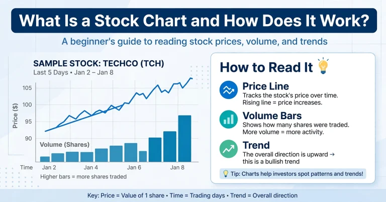
- Line charts connect closing prices only, which is useful for spotting the overall trend without the noise of intraday swings.
- Bar charts (OHLC bars) show open, high, low, and close using tick marks rather than a filled body — favored by some traders for a cleaner look at price extremes.
- Candlestick charts combine the readability of bar charts with a visual body that makes patterns easier to spot quickly, which is why most active traders default to this view.
New traders often start with line charts to understand the broader trend before moving to candlesticks once they’re comfortable interpreting individual price bars.
How to Read Trends, Support, and Resistance
Once you can read a single candle, the next step is reading the relationship between many candles — the trend. A trend is simply the general direction price is moving over time: up, down, or sideways. Ucharts displays this visually so you can quickly identify a series of higher highs and higher lows (an uptrend) or lower highs and lower lows (a downtrend).
Sideways, or “ranging,” markets are just as important to recognize as trending ones, even though they get less attention. In a range, price oscillates between a fairly consistent floor and ceiling without making meaningful progress in either direction. Many traders lose money by applying trend-following strategies to a ranging market, or by applying range strategies to a market that has already broken out into a trend. Learning to tell the difference at a glance is one of the most valuable skills a chart can teach you, and it’s often the first thing experienced traders check before doing anything else.
Identifying Support and Resistance Levels
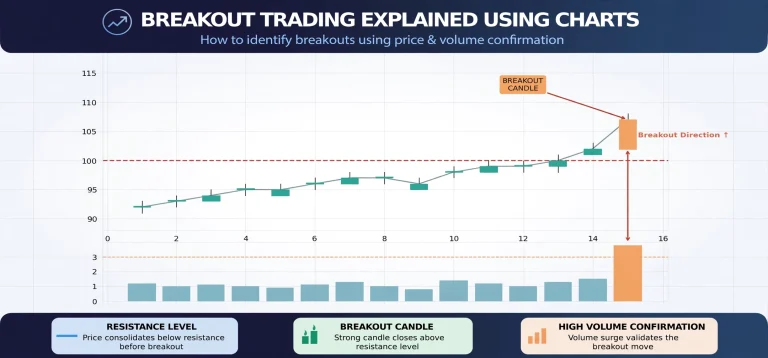
Support is a price level where buying pressure has historically been strong enough to stop a decline. Resistance is the opposite — a level where selling pressure has capped previous rallies. On a Ucharts chart, these levels often appear as horizontal zones where price has repeatedly reversed.
- Look for at least two or three prior touches at a similar price level before treating it as meaningful.
- Support can become resistance once broken, and vice versa — this is often called a “role reversal.”
- Combine support and resistance with volume, when available, to judge the strength of a level.
Popular Chart Patterns Every Trader Should Know
Chart patterns are recurring shapes formed by price action that traders use to anticipate potential continuation or reversal moves. None of these patterns guarantee an outcome, but recognizing them helps frame probability-based decisions.
Continuation Patterns
- Flags and pennants — brief consolidations after a strong move, often followed by continuation in the same direction.
- Ascending/descending triangles — a tightening price range that frequently resolves in the direction of the prevailing trend.
Reversal Patterns
- Head and shoulders — a classic reversal pattern signaling a potential trend change from up to down (or the inverse for a bottom).
- Double tops and double bottoms — two failed attempts to break a level, often preceding a reversal.
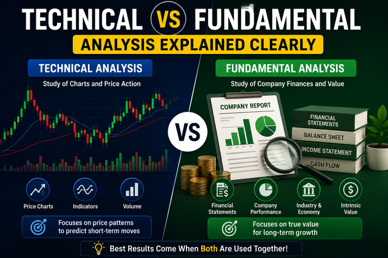
For a deeper comparison of how these visual patterns relate to underlying company or economic data, see our guide on technical vs. fundamental analysis, which explains when each approach is most useful.
Using Indicators Alongside Ucharts
Charts become more powerful when combined with technical indicators. Moving averages smooth out price to reveal the underlying trend direction. The Relative Strength Index (RSI) and other momentum tools help identify overbought or oversold conditions. Volume indicators confirm whether a price move has real conviction behind it or is likely to fade.
The key is restraint — layering too many indicators onto one chart often creates conflicting signals. Most experienced traders keep their charts clean, relying on price structure first and one or two supporting indicators second.
A practical approach many Ucharts users follow is to pick one trend indicator, one momentum indicator, and one volume-based indicator, then stick with that combination across every symbol they trade. Constantly swapping indicators in search of a “perfect” setup tends to create analysis paralysis rather than clarity. Consistency in your toolkit makes it easier to compare current price action against what you’ve seen historically on the same chart, which is where real pattern recognition starts to develop.
It’s also worth remembering that indicators are, by definition, derived from price — they are lagging by nature, even the ones marketed as “leading.” Treat them as a filter that confirms or questions what the raw candlesticks are already showing you, not as a standalone signal generator.
How to Use the Ucharts Trade Planner With Chart Reading
Reading a chart correctly is only half the job — the other half is sizing the trade so a single loss doesn’t derail your account. This is where the Ucharts Trade Planner comes in. After identifying a setup on the chart — say, a bounce off support with a clear stop-loss level below it — you can plug the entry, stop-loss, and take-profit prices directly into the planner to see position size and risk-reward ratio instantly.
This workflow keeps chart analysis and risk management connected, rather than treating them as separate steps that traders sometimes skip under pressure.
Common Mistakes When Reading Charts
- Overfitting patterns — seeing a “perfect” head and shoulders pattern in every chart, even when the structure is weak.
- Ignoring timeframes — a strong uptrend on a 5-minute chart can be a minor blip on the daily chart. Always check the higher timeframe for context.
- Trading without a stop-loss — even a technically sound setup can fail; risk controls matter more than any single pattern.
- Chasing price — entering after a big move rather than waiting for a valid setup near support or resistance.
Regulators such as the U.S. Investor.gov resource on how markets work consistently emphasize that no charting method removes market risk entirely — chart reading improves the odds of a well-timed decision, but it does not guarantee outcomes.
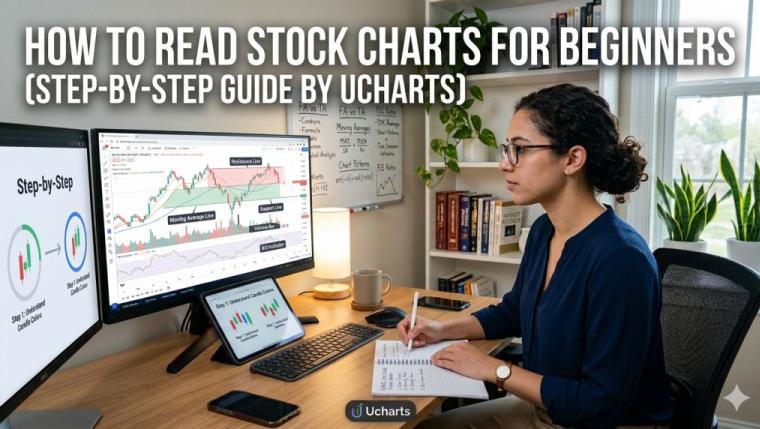
Step-by-Step: Reading a Chart on Ucharts
- Open the symbol you want to analyze and select the candlestick view.
- Zoom out to the daily or weekly timeframe first to identify the broader trend.
- Mark the nearest support and resistance zones based on prior price reactions.
- Switch to your trading timeframe and look for a pattern or candle signal near those zones.
- Define your entry, stop-loss, and target, then run the numbers through the Ucharts Trade Planner.
- Confirm the trade fits your risk tolerance before executing.
Conclusion
The Ucharts trading charting tool is designed around a simple idea: clear charts lead to clearer decisions. By learning to read candlesticks, identify trends, mark support and resistance, and recognize common chart patterns, traders build a foundation that works across stocks, forex, metals, and crypto alike. Pairing that chart-reading skill with the built-in trade planning tools helps close the gap between spotting a setup and managing it responsibly.
Chart reading is a skill that improves with repetition. The more charts you study — winning and losing setups alike — the faster you’ll recognize meaningful structure versus noise.