What Is Technical Analysis in Trading? Full Guide for Beginners
What Is Technical Analysis in Trading?
A full, no-fluff breakdown of charts, indicators, patterns, and strategies — written for people just starting out in the markets.
What Is Technical Analysis?
Walk into any trading room — physical or digital — and you’ll see screens filled with squiggly lines, colored bars, and numbers flashing in real time. To an outsider, it looks like chaos. But to someone who understands technical analysis, those charts tell a story as clear as words on a page.
At its core, technical analysis (TA) is the practice of studying historical price and volume data to forecast future price movements. Rather than asking “Is this company profitable?”, a technical analyst asks “What has this price been doing, and where is it most likely to go next?”
The discipline rests on three foundational beliefs, first articulated by Charles Dow in the early 1900s:
1. The market discounts everything. All known information — earnings, news, economic data, even emotions — is already reflected in the price. So the price itself is the most important piece of data.
2. Prices move in trends. Once a trend is established, a price is more likely to continue in that direction than to reverse. This is the engine that drives most TA strategies.
3. History tends to repeat itself. Market participants react to similar situations in similar ways, creating recurring patterns that can be identified and acted upon.
These assumptions don’t need to be perfect truths — they just need to be true enough, often enough, to give an edge. And for millions of traders across stocks, forex, crypto, and commodities, they have proven remarkably useful over decades of application.
“The tape tells all.” — Jesse Livermore, one of history’s most successful stock speculators
Livermore’s famous quote captures the TA mindset perfectly. Forget the noise. The price action on the chart — the tape — reflects everything the market knows and feels. Learn to read it, and you have a tool for navigating markets with greater confidence.
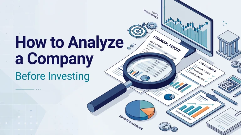
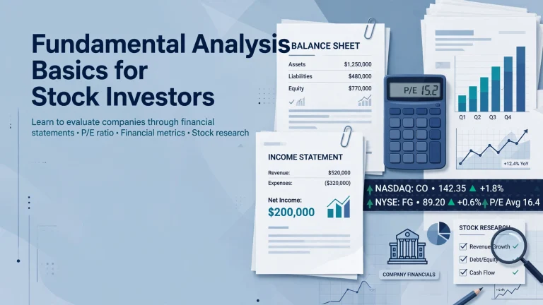
Technical Analysis vs. Fundamental Analysis
New traders often wonder: should I care about company earnings and economic reports, or should I just look at charts? The honest answer is that both approaches have genuine value — and the best traders often use elements of both.
| Category | Technical Analysis | Fundamental Analysis |
|---|---|---|
| Core question | Where is the price going? | What is this asset worth? |
| Primary data | Price charts, volume, indicators | Earnings, revenue, balance sheets, macro data |
| Time horizon | Short to medium term | Medium to long term |
| Best suited for | Active traders, day traders, swing traders | Investors, buy-and-hold strategies |
| Entry/exit timing | Precise | Less precise |
| Works on | Any liquid market with price history | Assets with measurable financials |
| Main weakness | Can fail during unexpected news events | Market can stay “wrong” for a very long time |
Many professional traders use fundamental analysis to decide what to trade (which sector, which stock, which currency pair) and technical analysis to decide when to enter and exit. This blended method often produces the most robust results.
Types of Price Charts
Before diving into patterns and indicators, you need to understand the different ways price data can be displayed. Each chart type reveals slightly different information, and choosing the right one matters depending on what you’re trying to analyze.
Line Chart
Plots only the closing price of each period. The simplest and cleanest view — great for spotting overall direction and major trend lines.
Bar Chart (OHLC)
Shows the Open, High, Low, and Close for each period. More data than a line chart, displayed as vertical bars with horizontal ticks.
Candlestick Chart
The most popular among traders. Like OHLC bars but with color-coded bodies that make bullish and bearish sessions immediately obvious.
Heikin-Ashi
A modified candlestick chart that smooths price action, making trends easier to identify — but at the cost of hiding exact price levels.
Point & Figure
Ignores time entirely and focuses only on significant price movements. Excellent for filtering out market noise on liquid assets.
Renko Chart
Like point & figure, Renko charts filter noise by only plotting “bricks” when price moves a set amount — very helpful for trend traders.
For most beginners, candlestick charts are the best starting point. They’re widely used, heavily documented, and carry more visual information than line charts without the complexity of more exotic chart types.
How to Read Candlestick Charts
A single candlestick is a complete story of a trading period — it tells you where price opened, where it traveled to (both up and down), and where it settled when the period ended. Master reading individual candles, and you’ve laid the foundation for everything else in technical analysis.
🕯️ Anatomy of a Candlestick
Close > Open
Close < Open
Indecision
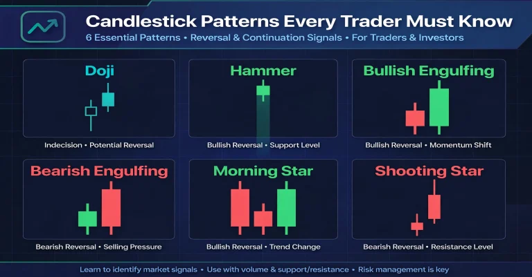
Key Candlestick Patterns to Know
Individual and multi-candle patterns are among the most widely studied tools in all of trading. Here are the most important ones you’ll encounter:
Hammer
A small body at the top with a long lower shadow. Appears at the bottom of a downtrend, suggesting sellers pushed price down but buyers took control by the close.
Shooting Star
A small body at the bottom with a long upper shadow. Appears at the top of an uptrend, suggesting buyers initially pushed price up but sellers regained control.
Bullish Engulfing
A small bearish candle followed by a large bullish candle that completely “engulfs” the previous one. A strong reversal signal after a downtrend.
Bearish Engulfing
A small bullish candle followed by a large bearish candle that engulfs it. Signals that sellers have overpowered buyers after an uptrend — often precedes a drop.
Morning Star
A three-candle pattern: a large bearish candle, a small indecisive candle (often a Doji), then a large bullish candle. One of the most reliable reversal signals.
Evening Star
The mirror image of the Morning Star, appearing at the top of an uptrend. Signals exhaustion among buyers and an incoming reversal lower.
Never interpret a candlestick pattern in isolation. A hammer at a major support level carries far more weight than a hammer in the middle of a range. Always ask: where in the broader market structure does this pattern appear?
Trends, Support & Resistance
Understanding market structure — the underlying framework of price movement — is arguably the single most important skill in technical analysis. Everything else builds on top of it.
The Three Types of Trend
Markets don’t move in straight lines. They move in waves, and those waves create trends:
Uptrend (Bullish)
Characterized by a series of Higher Highs (HH) and Higher Lows (HL). Each rally reaches a new peak, and each pullback stops at a higher level than the last. Buyers are firmly in control.
Downtrend (Bearish)
Characterized by Lower Highs (LH) and Lower Lows (LL). Each bounce falls short of the previous peak, and sellers push price to new lows. Sellers are firmly in control.
Sideways / Ranging
Price moves horizontally between two levels without establishing a clear direction. Neither buyers nor sellers have conviction. This is where many traders get chopped up trying to force trades.
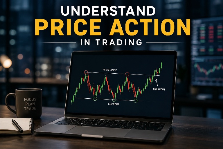
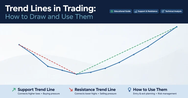
Support and Resistance — The Pillars of Price
Support is a price level where buying interest is strong enough to halt a downward move. Think of it as a floor beneath the price. Resistance is the opposite — a ceiling where selling pressure prevents further upward movement.
One of the most important principles in technical analysis is that once broken, support becomes resistance and resistance becomes support. When price breaks above a resistance level, that level often becomes a new support on a pullback — and vice versa. This “polarity flip” is one of the most reliable behaviors in all of TA.
A trend line is simply a diagonal line drawn connecting a series of higher lows (in an uptrend) or lower highs (in a downtrend). When two parallel trend lines are drawn — one for highs and one for lows — you get a price channel. Price channels make it easier to see when a breakout is occurring and where future targets might be.
Classic Chart Patterns Every Trader Should Know
Chart patterns are formations that develop over time and signal potential future price movements. Unlike single candlestick patterns that form in one or two sessions, these patterns take days, weeks, or even months to form — and they tend to provide more significant trading signals as a result.
Continuation Patterns
These suggest the prevailing trend is likely to continue after a brief pause or consolidation.
Bull / Bear Flag
A sharp price move (the flagpole) followed by a tight, orderly consolidation angled against the trend (the flag). One of the most reliable short-term continuation patterns.
Ascending / Descending Triangle
Price coils between a flat level and a converging trend line. Typically breaks in the direction of the prevailing trend with increased volume.
Symmetrical Triangle
Two converging trend lines with no clear directional bias. Price is coiling with decreasing volatility, building energy for a breakout in either direction.
Cup and Handle
A rounded bottoming pattern (the cup) followed by a smaller downward drift (the handle). A classic long-term bullish continuation setup.
Reversal Patterns
These suggest the current trend is losing momentum and may be about to reverse.
Head and Shoulders
Three peaks with the middle one (the head) higher than the two outer ones (shoulders). One of the most reliable and widely known bearish reversal patterns. The neckline acts as the key support level.
Inverse Head and Shoulders
The bullish mirror image. Three troughs with the middle one deeper than the two outer ones. Breaking above the neckline signals a potential uptrend reversal.
Double Top
Price reaches a high, pulls back, then reaches the same high again but can’t break through. The second failure signals seller dominance and often triggers a significant decline.
Double Bottom
Price makes a low, bounces, then tests the same low again without breaking it. The second hold signals buyer strength — breaking the middle high (“neckline”) confirms the reversal.
Most chart patterns come with built-in measuring techniques. For example, with a Head and Shoulders pattern, you measure the distance from the head to the neckline and project that same distance downward from the breakout point. This gives you a minimum expected move — not a guarantee, but a data-driven target.
Technical Indicators Explained
Technical indicators are mathematical calculations based on price, volume, or both. They’re displayed on or beneath a chart and help traders gauge momentum, trend direction, volatility, and overbought/oversold conditions.
Indicators fall into two broad families:
Lagging indicators (like moving averages) follow price — they confirm what has already happened but can be slow to signal a change. Leading indicators (like RSI or Stochastic) attempt to predict future price moves, which makes them faster but also more prone to false signals. Skilled traders use both in combination.
The Most Important Indicators
Smooths price over a set number of periods to show the average direction. The 50-day and 200-day MAs are the most watched. When price is above the MA, the trend is bullish. The crossover of two MAs (e.g., the “Golden Cross” when 50MA crosses above 200MA) is a widely followed signal.
Oscillates between 0 and 100. Readings above 70 suggest overbought conditions (price may be due for a pullback); readings below 30 suggest oversold conditions (a bounce may be coming). Most powerful when showing divergence from price.
The Moving Average Convergence Divergence indicator compares two exponential moving averages. The MACD line crossing above the signal line is bullish; crossing below is bearish. The histogram shows the gap between the two, revealing momentum strength.
Three lines: a 20-period moving average and two bands placed two standard deviations above and below it. When bands squeeze together (low volatility), a large move is often imminent. When price touches the outer bands, it may revert to the mean.
Compares a security’s closing price to its range over a given period. Like RSI, it oscillates between 0 and 100. Readings above 80 are overbought; below 20 are oversold. Particularly useful in ranging markets for identifying turning points.
Based on the Fibonacci number sequence, these horizontal levels (23.6%, 38.2%, 50%, 61.8%, 78.6%) mark potential areas of support or resistance during a pullback. The 61.8% level (“the golden ratio”) is the most closely watched.
One of the most common beginner mistakes is stacking 10 different indicators on a chart and waiting for them all to agree. This almost never happens, and it leads to analysis paralysis. Choose two or three complementary indicators — one for trend, one for momentum, one for volatility — and learn them thoroughly. Less is genuinely more.
Understanding Volume Analysis
Volume — the number of shares, contracts, or coins traded in a given period — is one of the most underrated tools in the beginner trader’s toolkit. It’s often displayed as a bar chart beneath the main price chart, and it acts as a kind of “truth detector” for price moves.
The core principle is simple: price moves mean more when accompanied by high volume, and less when volume is low.
High volume + price move up = Bullish confirmation
Buyers are motivated and plentiful. This kind of move is more likely to continue because it reflects genuine demand, not just a handful of passive traders.
High volume + price move down = Bearish confirmation
Sellers are in control with conviction. A breakdown on high volume is a much stronger signal than one that occurs on thin, quiet trading.
Low volume + price move = Suspect signal
A big move on unusually low volume — especially a breakout — is often a “false move” that lacks the participation needed to sustain it. Treat these with caution.
Declining volume in a trend = Warning sign
If price is making new highs but volume is declining, it suggests the trend is losing participation. This divergence often precedes a reversal.
The On-Balance Volume (OBV) Indicator
OBV is a cumulative volume indicator. On bullish days, the day’s volume is added to a running total; on bearish days, it’s subtracted. When OBV rises along with price, the trend is confirmed. When OBV diverges from price — rising while price falls, or falling while price rises — it often signals an impending reversal.
Choosing the Right Timeframe
Every chart has a timeframe — the amount of time each candlestick or bar represents. A 1-hour chart means each candle covers one hour of trading activity. Choosing the right timeframe is one of the most personal decisions in trading, and it depends heavily on your lifestyle, personality, and goals.
| Timeframe | Candle Duration | Trading Style | Time Commitment |
|---|---|---|---|
| Tick / 1-min / 5-min | Seconds to 5 minutes | Scalping | Extreme |
| 15-min / 30-min | 15 to 30 minutes | Day trading | Very high |
| 1-hour / 4-hour | 1 to 4 hours | Day/swing trading | Moderate |
| Daily | 1 day | Swing trading | Low to moderate |
| Weekly / Monthly | 1 week to 1 month | Position trading | Very low |
Professional traders rarely look at just one timeframe. A common approach is to use a higher timeframe (e.g., the daily chart) to identify the overall trend direction, then drop to a lower timeframe (e.g., the 1-hour chart) to find precise entry points in the direction of that trend. This top-down approach filters out a lot of noise and produces higher-quality setups.
For most beginners, the 4-hour or daily chart is the ideal starting point. There’s enough price history to identify meaningful patterns, decisions don’t need to be made in seconds, and the noise of intraday movement is filtered out.
Building Your Trading Strategy
Understanding technical analysis tools individually is one thing. Combining them into a coherent, repeatable strategy is another — and it’s what separates people who trade from people who gamble. A solid strategy gives you a set of conditions to trade by, removing emotion from the equation.
The Key Components of Any TA Strategy
Define the Trend
Before anything else, know the overall direction of the market you’re in. Use a moving average, trend line, or higher timeframe analysis to establish whether the trend is up, down, or sideways. Only trade in the direction of the trend until you’re experienced enough to trade reversals.
Identify Your Entry Signal
A specific, objective trigger that initiates a trade. Examples: a candlestick pattern at a support level, an RSI crossing from below 30, a breakout above resistance with a volume spike. The signal must be specific and repeatable — not a feeling.
Set Your Stop-Loss
A stop-loss is the price at which you’ll exit a losing trade to limit your damage. This is non-negotiable. Place it at a logical level — just below a support, just above a resistance — where the market would prove your trade thesis wrong. Without a stop-loss, one bad trade can wipe out weeks of gains.
Define Your Target
Know where you plan to take profit before you enter. Common methods: measuring pattern projections, targeting the next major resistance level, or using a fixed risk-reward ratio (e.g., aim for 2× or 3× your risk on every trade).
Manage Your Position Size
Risk a consistent, small percentage of your total capital on each trade — typically 1–2% per position is the professional standard. This ensures that even a string of losses won’t cause catastrophic damage to your account. Consistent sizing is how small edges compound into large gains over time.
For example, if your account is $10,000, you risk 1% per trade ($100), your entry is $50, and your stop-loss is $48, your position size would be $100 ÷ $2 = 50 shares.
The Pros and Cons of Technical Analysis
✅ Advantages
- Works on any liquid market — stocks, forex, crypto, commodities
- Provides precise entry and exit points
- Removes subjective judgment by using objective rules
- Rich ecosystem of free tools and charting platforms
- Applicable across all timeframes, from seconds to months
- Allows you to define risk before entering a trade
⚠️ Limitations
- Past patterns don’t guarantee future outcomes
- Major news events can invalidate TA setups instantly
- Different analysts can read the same chart differently
- Requires significant practice before becoming effective
- Overuse of indicators leads to conflicting, confusing signals
- Susceptible to manipulation in low-liquidity markets
Common Beginner Mistakes in Technical Analysis
Most beginner traders lose money — not because technical analysis doesn’t work, but because they fall into predictable, avoidable traps. Here are the most important ones to know before you put real money on the line.
“I’ll just wait for it to come back.” These are some of the most expensive words in trading. Without a stop-loss, a small, manageable loss can become an account-destroying one. Every single trade you place must have a predetermined exit point if the market moves against you.
Seeing a price spike 20% and jumping in after the fact is one of the fastest ways to lose money. By the time you see the move, the professionals who set up the trade are often exiting — selling to late entrants like you. Wait for the next setup, not the current spike.
Many beginners feel they need to be in a trade at all times. In reality, professional traders spend more time waiting than trading. “Not trading” is a valid and often correct decision. Patient selectivity — only entering when your specific criteria are all met — is a major edge in itself.
Getting a “perfect” setup on a 5-minute chart while the daily chart shows a strong downtrend is a recipe for failure. Always check higher timeframes before entering a trade. A setup that agrees with the broader trend has a much higher probability of success.
You cannot improve what you don’t track. A trading journal that records your entry, exit, reasoning, and emotional state for every trade is one of the most powerful learning tools available — and almost no beginner uses one. Those who do dramatically accelerate their learning curve.
Preserve capital above all else. A 50% loss requires a 100% gain just to break even. A 10% loss only needs an 11% gain to recover. Keeping losses small is the single most important habit in long-term trading survival — far more important than finding the perfect entry.
Glossary of Key Technical Analysis Terms
Here’s a quick reference for the most important terms you’ll encounter as you study technical analysis:
Your Journey in Technical Analysis Has Just Begun
The concepts in this guide — candlesticks, support and resistance, indicators, chart patterns — are the building blocks that every successful technical trader has learned and internalized through practice. There are no shortcuts, but there is a clear path forward.
Start with a free paper trading account (simulated trading with no real money at risk), apply one or two of these tools at a time, keep a journal of every trade, and focus relentlessly on your process rather than short-term results. The edge in technical analysis comes from patience, discipline, and consistency — not from finding the perfect indicator or the secret pattern.
📚 Recommended next steps: practice reading charts daily → backtest a simple strategy → paper trade for 60 days → evaluate results before committing real capital.