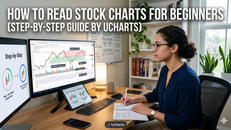
How to Read Stock Charts for Beginners (Step-by-Step Guide by Ucharts)
If you’ve ever pulled up a stock chart and felt like you were staring at a foreign language, you’re not alone. Candlesticks, moving averages, volume bars, RSI — it can feel overwhelming at first glance. But here’s the truth: reading stock charts is a skill, not a gift. Anyone willing to invest a little time can learn it, and once you do, you’ll never look at the market the same way again.
This guide is written specifically for beginners — no jargon dumps, no assumption that you already know what a “Bollinger Band” is. We’ll walk through everything step by step, from understanding what a stock chart actually shows you, to interpreting the signals that experienced traders look for every single day.
Let’s get into it.
What Is a Stock Chart and Why Does It Matter?
A stock chart is simply a visual record of a stock’s price movement over time. Think of it like a heartbeat monitor — instead of tracking a pulse, it tracks price. At its most basic level, a chart tells you two things: what a stock did in the past and what it might do next.
Now, the “might” part is where things get interesting.
Charts are the backbone of what’s called technical analysis — the practice of using historical price data to forecast future price behavior. Unlike fundamental analysis (which looks at earnings reports, revenue, and business models), technical analysis is all about patterns, momentum, and market psychology.
If you want to go deeper on that distinction, our guide on Technical Analysis in Trading is a great companion read to this article.
The reason charts matter is simple: price tells you what millions of buyers and sellers collectively believe a stock is worth right now. When you understand how to read that story, you gain a powerful edge.
Step 1: Understand the Basic Structure of a Stock Chart
Before you can interpret anything, you need to know what you’re looking at. Every stock chart has the same basic anatomy.
The X-Axis (Time)
The horizontal axis represents time. Depending on the chart type you choose, this could span minutes, hours, days, weeks, months, or even years. A 1-day chart shows price movement minute by minute throughout a single trading day. A 5-year chart zooms out and shows the long-term trend.
As a beginner, you’ll mostly work with daily charts — each data point represents one full trading day. This is the most commonly used timeframe for swing traders and long-term investors alike.
The Y-Axis (Price)
The vertical axis shows the price of the stock. When the chart moves upward, price is rising. When it dips, price is falling. Simple enough, right?
Volume Bars
Below the main price chart, you’ll almost always see a series of vertical bars. These represent trading volume — how many shares were bought and sold during each time period. Volume is one of the most underrated pieces of information a chart gives you. We’ll come back to this.
Step 2: Learn the Most Common Chart Types
There are several ways to display price data on a chart. Here are the three you’ll encounter most often:
Line Charts
The simplest type. A line chart connects the closing price of each period with a continuous line. It’s clean, easy to read, and great for spotting the overall direction of a stock. The downside? It hides a lot of detail about what happened during each trading period.
Bar Charts (OHLC)
Bar charts show four data points for each period: Open, High, Low, and Close — often abbreviated as OHLC. Each bar has a vertical line spanning the high and low of the period, with a small tick on the left showing the opening price and a tick on the right showing the closing price.
Bar charts give you far more information than a line chart, but they can look busy to beginners.
Candlestick Charts
Candlestick charts are the gold standard for most traders, and for good reason. Originally developed in Japan in the 18th century to track rice prices, candlestick charts are intuitive once you know how to read them.
Each “candle” represents one time period and shows:
- The body: The thick colored section between the open and close
- The wicks (or shadows): The thin lines extending above and below the body, showing the high and low
Color coding matters:
- A green (or white) candle means the price closed higher than it opened — buyers won that period
- A red (or black) candle means the price closed lower than it opened — sellers won that period
A long green candle with a small wick tells a very different story than a small red candle with a massive wick. Experienced traders read these differences automatically. For a more in-depth look, check out Ucharts’ full guide on how to read stock charts which goes deep into candlestick patterns specifically.
Step 3: Identify the Trend
This is where chart reading starts to become genuinely powerful. One of the oldest rules in trading is: the trend is your friend. Before you analyze anything else on a chart, ask yourself one question: Which direction is this stock moving?
There are three possible answers:
Uptrend (Bullish)
A stock is in an uptrend when it’s making a series of higher highs and higher lows. Picture a staircase climbing upward. Each peak is higher than the last, and each pullback stops at a higher level than the previous one. This tells you buyers are consistently in control.
Downtrend (Bearish)
The opposite: lower highs and lower lows. Each rally gets weaker, and each dip goes deeper. Sellers are in control.
Sideways (Consolidation)
Sometimes a stock doesn’t really go anywhere — it bounces between two rough price levels. This is called consolidation or a ranging market. It often precedes a significant move in either direction.
Why does trend identification matter so much? Because it changes everything about how you interpret signals. A bullish candle pattern carries more weight in an uptrend than in a downtrend. A stock “bouncing” off a support level is far more significant if the broader trend is up.
Step 4: Understand Support and Resistance
If trends are the story, support and resistance are the chapter breaks.
Support
Support is a price level where a stock has repeatedly stopped falling and bounced back up. Think of it as a floor. Buyers tend to step in at this level because they see value. The more times a stock has respected a support level, the more significant that level becomes.
Resistance
Resistance is the opposite — a ceiling. It’s a price level where a stock has struggled to push above. Sellers consistently show up at this level and push the price back down.
Here’s the fascinating part: when a resistance level is broken (price pushes above it convincingly), it often becomes new support. The same works in reverse. This is called a role reversal, and it’s one of the most reliable patterns in all of technical analysis.
Support and resistance aren’t always exact price points — they’re more like zones. Don’t expect a stock to bounce from $47.23 every single time; look at the $45–$48 area as a general zone of interest.
Step 5: Add Moving Averages
Moving averages are one of the most widely used tools in technical analysis, and for good reason: they smooth out the noise of day-to-day price fluctuations and help you see the underlying trend more clearly.
What Is a Moving Average?
A Simple Moving Average (SMA) takes the average closing price of a stock over a set number of periods. For example, a 50-day SMA adds up the closing prices of the last 50 days and divides by 50. Each day, the oldest data point drops off and the newest one is added — that’s why it “moves.”
The Most Common Moving Averages
- 20-day SMA: Short-term trend; useful for active traders
- 50-day SMA: Medium-term trend; the most-watched average on Wall Street
- 200-day SMA: Long-term trend; the dividing line between bull and bear territory for many investors
How to Use Them
When a stock price is above its 200-day moving average, it’s generally considered healthy and in a long-term uptrend. When it’s below, caution is warranted.
A classic signal traders watch for is called the Golden Cross: when the 50-day SMA crosses above the 200-day SMA, it’s seen as a bullish long-term signal. The opposite — the 50-day crossing below the 200-day — is called the Death Cross, and it’s bearish.
Moving averages also act as dynamic support and resistance. Many stocks will pull back to their 50-day SMA during an uptrend before bouncing higher again.
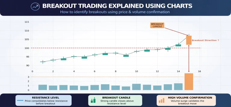
Step 6: Read Volume Like a Pro
Volume is the number of shares traded during a period, and it’s the single most overlooked tool by beginners. Here’s the fundamental rule:
Price moves mean more when they happen on high volume.
Think of volume as the market’s conviction. When a stock breaks above a resistance level on heavy volume, it suggests strong interest and buying pressure — the breakout is more likely to be real. When the same breakout happens on thin, weak volume, it’s far more likely to be a false start (called a “fakeout”).
Some key volume signals to watch:
- High volume on an up day: Strong buying interest — bullish
- High volume on a down day: Heavy selling pressure — bearish
- Price rising, volume declining: Buyers are losing enthusiasm — potential warning sign
- Volume spike during a reversal: Could signal a bottom or top — pay close attention
Our analysis of Stock Market Analysis covers how volume analysis ties into broader market reads, which is worth exploring as you advance.
Step 7: Get Familiar with Basic Technical Indicators
Beyond moving averages, there are several indicators beginners should at least understand. You don’t need to use all of them — most experienced traders use just two or three consistently.
Relative Strength Index (RSI)
The RSI is a momentum oscillator that measures how fast and how much a stock’s price has changed. It runs on a scale from 0 to 100.
- Above 70: The stock is considered overbought — it may have risen too far, too fast
- Below 30: The stock is considered oversold — it may have fallen too far, too fast
RSI is best used in conjunction with other signals, not in isolation. A stock can stay “overbought” for a long time in a strong uptrend.
MACD (Moving Average Convergence Divergence)
Pronounced “MAC-D,” this indicator shows the relationship between two exponential moving averages (usually 12-period and 26-period). It has two components:
- The MACD line: The difference between the two moving averages
- The Signal line: A 9-period moving average of the MACD line
When the MACD line crosses above the signal line, many traders interpret that as a buy signal. When it crosses below, it’s bearish. The histogram (vertical bars between the two lines) shows the strength of the momentum.
Bollinger Bands
Bollinger Bands consist of three lines: a 20-day moving average in the middle, with an upper and lower band set two standard deviations above and below. When price touches the upper band, some traders see it as overbought; touching the lower band suggests oversold.
More importantly, when the bands squeeze tight (meaning volatility has dropped significantly), it often precedes a major price move in either direction. Traders call this the “Bollinger Squeeze.”
Step 8: Recognize Common Chart Patterns
Certain price patterns repeat themselves across markets and timeframes because human psychology is consistent. Traders have been studying these for decades.
Head and Shoulders
One of the most well-known reversal patterns. It looks exactly like it sounds: a peak (left shoulder), a higher peak (head), and a lower peak (right shoulder), connected by a “neckline.” When price breaks below the neckline, it signals the uptrend may be reversing.
The inverse version — an inverted head and shoulders — signals a potential reversal of a downtrend.
Double Top and Double Bottom
A double top forms when a stock hits roughly the same resistance level twice, fails to break through, and drops. It’s a bearish reversal signal.
A double bottom is the mirror image: price hits a similar support level twice and bounces back up both times — a bullish reversal signal.
Flags and Pennants
These are continuation patterns — they form during a strong trend as the price takes a brief pause before continuing in the same direction. A flag looks like a rectangle tilted against the trend; a pennant looks like a small symmetrical triangle.
These are beloved by shorter-term traders because they offer clear entry points and defined risk levels.
Cup and Handle
Made famous by investor William O’Neil, this pattern looks like a tea cup viewed from the side: a rounded bowl shape (the cup) followed by a slight pullback (the handle). A breakout above the handle is considered a strong bullish signal, particularly when accompanied by high volume.
Step 9: Use Multiple Timeframes
One of the most powerful techniques experienced traders use is multi-timeframe analysis. The idea is straightforward: look at the same stock on different timeframes to get a fuller picture.
A common approach:
- Start with the weekly chart to understand the long-term trend and major support/resistance levels
- Move to the daily chart for the medium-term picture and to identify chart patterns
- Use the hourly or 15-minute chart to time your entry with more precision
If all three timeframes agree — say, the stock is in an uptrend on the weekly, breaking out of a pattern on the daily, and showing momentum on the hourly — the trade setup is far stronger than if the signals are mixed.
This is the kind of analysis approach that platforms like Ucharts are built to support, giving traders the ability to toggle between timeframes and indicators seamlessly.
Step 10: Understand What Charts Can’t Tell You
Reading charts well also means understanding their limits. Charts show you the what — what the price did, what the volume was, what the trend is — but they can’t always tell you the why.
A stock can be in a beautiful uptrend with perfect technical structure and then gap down 15% overnight because of an earnings miss, a regulatory decision, or a CEO resignation. Fundamental events can override technical patterns in an instant.
This is why most sophisticated traders combine technical analysis with at least a basic awareness of fundamentals. You don’t need to build a discounted cash flow model, but knowing when a company reports earnings, understanding whether a sector is in or out of favor, and having a pulse on broader market sentiment all make your chart reading more effective.
If you’re looking at where the market as a whole is heading, our Future Outlook and Market Predictions guide adds valuable macroeconomic context to your technical work.
Practical Tips for Beginner Chart Readers
Here are some hard-earned lessons that most beginners have to learn the slow way. Consider this a shortcut:
Start with fewer indicators, not more. It’s tempting to load up a chart with every indicator available. Resist that urge. More indicators mean more noise and more conflicting signals. Pick two or three that resonate with you and get genuinely good at reading them.
Context matters more than patterns. A “bullish” candlestick pattern at a major resistance level during a downtrend is far less meaningful than the same pattern at a well-established support level during an uptrend. Always zoom out before you zoom in.
Volume confirms price. This cannot be said enough. Never trust a breakout or breakdown without checking the volume behind it.
Practice on paper before using real money. Most trading platforms and charting tools offer paper trading (simulated trading with no real money at risk). Use it. Read charts daily, make mock trades, and track your results. You’ll learn faster by doing than by reading.
Keep a trading journal. Write down why you’re reading a chart setup as bullish or bearish. Note what you expected and what actually happened. Over time, you’ll develop genuine pattern recognition that goes beyond the textbook.
Understand the difference between timeframes. A pattern that’s significant on a daily chart carries much more weight than the same pattern on a 5-minute chart. The higher the timeframe, the more meaningful the signal.
Getting Started with Ucharts
One of the most important decisions a beginning chart reader can make is choosing the right platform. A cluttered, slow, or poorly-designed charting tool makes learning harder than it needs to be.
Ucharts is built with clarity and functionality in mind. Whether you’re tracking individual stocks, monitoring broader market trends, or exploring sector movements, the platform gives you the tools to put what you’ve learned here into practice.
If you haven’t already, you can create your Ucharts account and start exploring charts with real market data. And if you’re wondering about the full range of features available, this breakdown of the benefits of using Ucharts covers everything from the interface to the available data tools.
For traders interested in expanding beyond manual chart reading, our guide on automated trading robots explores how algorithmic systems use technical signals programmatically — a natural next step once you’ve mastered the basics.
A Word on Patience and Realistic Expectations
Learning to read charts well takes time. Don’t expect to look at a few candlestick tutorials and immediately start making accurate calls. The traders you see discussing charts with confidence have usually spent years looking at thousands of setups, making mistakes, and refining their process.
The good news? You don’t need to be perfect to be profitable. You just need to be right more often than you’re wrong, manage your risk properly when you’re wrong, and let your winners run. Those aren’t technical analysis concepts — they’re discipline and mindset. But they’re just as important as anything on this page.
Start simple. Learn the trend. Understand support and resistance. Add moving averages. Watch volume. Layer in one or two indicators. And look at charts every single day.
The patterns will start to become second nature before you even realize it’s happening.
Final Thoughts
Reading stock charts is one of the most empowering skills you can develop as an investor or trader. It gives you a language for understanding market behavior — not just what happened, but why it might have happened and what could come next.
The step-by-step framework in this guide gives you a solid foundation:
- Understand the chart structure (axes, volume, time)
- Learn the three chart types (line, bar, candlestick)
- Identify the trend
- Recognize support and resistance
- Apply moving averages
- Read volume signals
- Use momentum indicators (RSI, MACD)
- Spot classic chart patterns
- Practice multi-timeframe analysis
- Combine technical and fundamental awareness
Keep coming back to these fundamentals. Even traders with decades of experience still spend most of their analysis time on these core concepts — because they work.
Explore more educational content, tools, and market analysis at Ucharts.org — built for traders who take their learning seriously.
Related Reading: