
How to Use Charting Tools for Better Trading Decisions
A practical guide to reading price charts, choosing the right indicators, and turning raw market data into a repeatable trading process.
Every trader looks at the same price data, yet only a handful consistently make money from it. The difference usually comes down to how well someone reads a chart. Charting tools do not predict the future, but they organize price history into a visual language that reveals momentum, exhaustion, and turning points long before a headline explains them. This guide breaks down the charting tools that matter, how to combine them without cluttering your screen, and how to turn what you see into a disciplined trading plan.
Why Charting Tools Matter in Trading
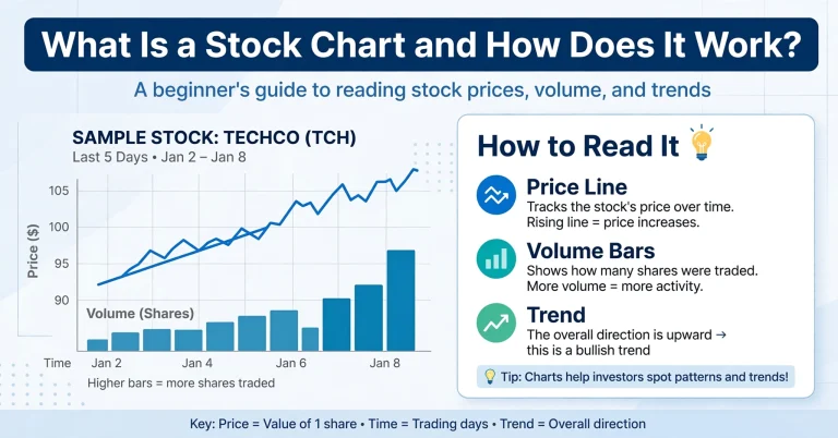
Price charts compress thousands of individual trades into a single visual story. Instead of scrolling through rows of numbers, a trader can glance at a chart and immediately sense whether buyers or sellers are in control. This is why charting is the foundation of technical analysis: it turns raw data into patterns the human eye can recognize and act on quickly.
Good charting tools also remove guesswork. A clean chart with the right indicators tells you where price has previously reacted, how volatile an instrument has been, and whether momentum is building or fading. Traders who skip this step often end up reacting emotionally to news instead of following a structured process.
Types of Charts Every Trader Should Know
Not all charts display the same information the same way. Choosing the right chart type is the first decision that shapes how you interpret everything else.
Line Charts
A line chart connects closing prices over time. It is the simplest visualization and works well for spotting the broader trend without the noise of intraday swings. New traders often start here because it strips away distraction and highlights the overall direction of a market.
Bar Charts
Bar charts add more detail by showing the open, high, low, and close for each period. The small tick marks on either side of the vertical bar represent the opening and closing prices, giving a fuller picture of the trading range within a session.
Candlestick Charts
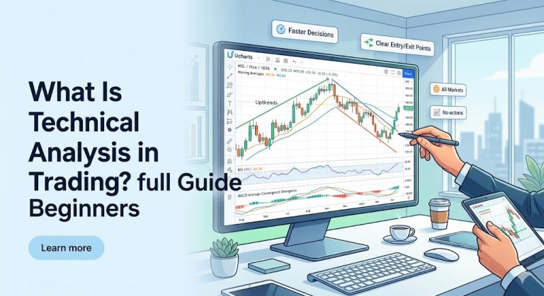
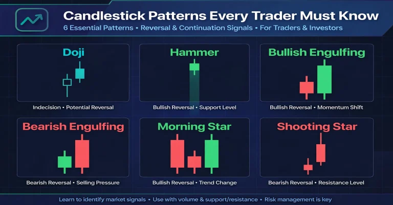
Candlestick charts are the most widely used format among active traders because the colored bodies make it easy to see at a glance whether a period closed higher or lower than it opened. Patterns such as dojis, engulfing candles, and hammers are built entirely around candlestick structure and are often the first signals traders learn to recognize.
Key Technical Indicators to Pair With Charts
Once you are comfortable reading raw price action, indicators can add context. The goal is not to stack as many indicators as possible, but to choose two or three that answer different questions: trend direction, momentum, and volatility.
Moving Averages
Moving averages smooth out price data to reveal the underlying trend. A simple 50-period or 200-period moving average is commonly used to judge whether a market is in a broader uptrend or downtrend, and crossovers between short-term and long-term averages are a popular signal for trend shifts.
Relative Strength Index (RSI)
RSI measures the speed and magnitude of recent price changes on a scale of 0 to 100. Readings above 70 are traditionally viewed as overbought, while readings below 30 suggest oversold conditions. RSI works best when combined with trend context rather than used in isolation.
MACD
The Moving Average Convergence Divergence indicator tracks the relationship between two moving averages and is useful for spotting shifts in momentum before they show up clearly in price. Many traders watch for MACD line crossovers as an early signal that a trend may be gaining or losing strength.
| Indicator | What It Measures | Best Used For |
|---|---|---|
| Moving Average | Trend direction | Confirming the broader market bias |
| RSI | Momentum / overbought-oversold | Timing entries within a trend |
| MACD | Momentum shifts | Spotting early trend changes |
How to Read Chart Patterns
Patterns form because human behavior around fear and greed repeats itself across markets and time frames. Learning to recognize a handful of reliable patterns gives you a framework for anticipating what price might do next.
Support and Resistance
Support is a price level where buying pressure has historically stepped in, while resistance is where selling pressure has previously capped price advances. These levels are not exact lines but zones, and price often reacts to them multiple times before eventually breaking through.
Trend Lines
Drawing a trend line by connecting a series of higher lows in an uptrend, or lower highs in a downtrend, helps visualize the pace of a move. A break of a well-established trend line is often one of the earliest warning signs that momentum is shifting.
Reversal vs. Continuation Patterns
Some patterns, like head and shoulders or double tops, suggest a trend may be ending. Others, like flags and pennants, suggest a brief pause before the existing trend resumes. Learning to tell these apart prevents traders from exiting a strong trend too early or holding on too long during a genuine reversal.
For a deeper look at how these visual signals compare to analyzing company fundamentals, see our detailed breakdown on technical vs fundamental analysis, which explains when each approach is most useful.
Choosing the Right Time Frame for Your Trading Style
One of the most overlooked parts of charting is time frame selection. The same instrument can look bullish on a daily chart and bearish on a 15-minute chart at the exact same moment, and traders who ignore this mismatch often end up confused about why their setups keep failing.
Scalpers and day traders typically live on shorter time frames, from 1-minute to 1-hour charts, where they react to small, fast price movements throughout a single session. Swing traders usually prefer 4-hour and daily charts, holding positions for several days to weeks while filtering out the noise of intraday volatility. Long-term position traders lean on weekly and monthly charts, where individual candles represent much longer periods and short-term fluctuations barely register.
A practical habit is to always check one time frame above the one you plan to trade on. If you trade on the 1-hour chart, glance at the 4-hour or daily chart first to confirm you are not fighting the broader trend. This simple top-down check filters out a large percentage of low-quality setups before they ever reach your entry checklist.
Combining Charting Tools With Risk Management
A chart can tell you where a trend might be heading, but it cannot tell you how much of your account to risk on that idea. This is where risk management steps in as the second half of every trading decision. Even a well-read chart pattern fails if position sizing is careless or a stop loss is placed without any logic.
Before entering any trade based on a chart signal, decide your risk per trade as a percentage of your account, and let that number—not your emotions—determine your position size. Tools that calculate this automatically remove much of the mental math that leads to oversized, high-risk positions. Our Position Size Calculator is built for exactly this step, letting you plug in your entry, stop loss, and risk tolerance to get an exact trade size in seconds.
Want to test a trade idea before risking real capital? Try the free Ucharts Trade Planner and calculators to check position size, pips, and risk-reward in seconds.
Step-by-Step: Building a Chart-Based Trading Plan
- Pick a time frame that matches your style. Day traders often work on 5-minute to 1-hour charts, while swing traders lean toward 4-hour and daily charts.
- Identify the dominant trend. Use a moving average or simple trend line to establish whether the broader bias is bullish, bearish, or range-bound.
- Mark key support and resistance zones. These levels become your reference points for entries, stop losses, and profit targets.
- Confirm with a momentum indicator. RSI or MACD can help you avoid entering right as momentum is fading.
- Calculate position size before entering. Decide your risk percentage first, then size the trade to match, rather than guessing.
- Review the trade afterward. Compare what the chart showed against what actually happened, and refine your process over time.
Common Mistakes to Avoid
- Overloading the chart: Stacking ten indicators on one screen usually creates conflicting signals rather than clarity.
- Ignoring the broader time frame: A bullish signal on a 5-minute chart means little if the daily chart is in a strong downtrend.
- Trading patterns in isolation: A chart pattern without a matching risk-reward setup is just a guess, not a plan.
- Skipping risk management: Even an accurate chart read can wipe out an account if position sizing is ignored.
Frequently Asked Questions
Which charting tool is best for beginners?
Most beginners start with candlestick charts paired with a single moving average. This combination is simple enough to understand quickly while still revealing trend direction and basic reversal signals without overwhelming a new trader with too much visual noise.
How many indicators should I use at once?
Two to three indicators are usually enough, as long as each one measures something different, such as trend, momentum, and volatility. Adding several indicators that all measure the same thing tends to create false confidence rather than genuinely better signals.
Can charting tools guarantee profitable trades?
No tool can guarantee results, since markets are influenced by countless unpredictable factors. Charting tools improve the odds by organizing information clearly, but they must always be paired with sound risk management and a tested trading plan to be genuinely useful.
Final Thoughts
Charting tools work best when they are treated as a decision-support system rather than a crystal ball. Start with clean price charts, add a small number of indicators that answer specific questions, learn to recognize a handful of reliable patterns, and always pair your analysis with disciplined risk management. Over time, this combination builds the kind of consistency that separates traders who last from those who burn out chasing every signal on the screen.
Further reading: Investopedia – Technical Analysis and Investor.gov – How Stock Markets Work.