How to Read Stock Market Trends Like a Professional Trader
A complete, practical guide to identifying uptrends, downtrends, and sideways markets — with volume, moving averages, price structure, and momentum.
Walk into any trading floor and you’ll notice something quickly: professional traders don’t stare at charts trying to predict the future. They study trend structure, listen to what price is telling them, and position themselves to ride moves that already have momentum behind them.
Reading market trends isn’t magic. It’s a repeatable skill built on a few core concepts that most retail traders rush past. This guide slows everything down so you can understand it at a level that actually changes how you trade.
Whether you use UCharts for your analysis or any other charting tool, the principles here are universal. Let’s get into it.
1. What Is a Market Trend — Really?
A trend is simply the general direction in which a market is moving over a given time period. This sounds obvious, but most traders fail at the most basic level because they can’t separate noise from direction.
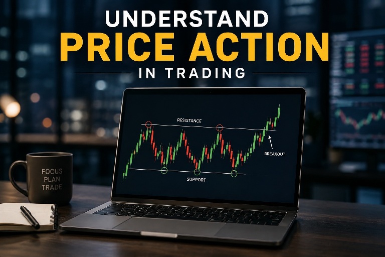
Markets don’t move in straight lines. A stock going up will still have pullbacks. A stock falling will have bounces. The question isn’t whether price is moving up or down at any given second — it’s whether the overall structure is bullish, bearish, or neutral.
Uptrend
Price makes higher highs (HH) and higher lows (HL). Each pullback holds above the previous low.
Downtrend
Price makes lower highs (LH) and lower lows (LL). Each bounce fails below the previous high.
Sideways (Range)
Price oscillates between a defined support and resistance without making new directional highs or lows.
The legendary trader Charles Dow identified this pattern in the early 1900s through what became known as Dow Theory, and it remains the foundation of technical analysis today. Higher highs and higher lows = uptrend. Lower highs and lower lows = downtrend. It’s the most powerful and most underused concept in retail trading.
2. The Three Types of Trends (And Why Timeframe Matters)
Here’s something that confuses new traders: a stock can be in an uptrend on a weekly chart and a downtrend on a 15-minute chart at the same time. Both are true. Neither is wrong. The difference is timeframe.
| Trend Type | Duration | Best Timeframes | Who Uses It |
|---|---|---|---|
| Primary (Major) | Months to years | Weekly, Monthly | Investors, position traders |
| Intermediate | Weeks to months | Daily, 4H | Swing traders |
| Minor (Short-term) | Days to weeks | 1H, 15min, 5min | Day traders, scalpers |
Professional traders always start with the higher timeframe to understand the dominant trend, then drop to lower timeframes to find entries. Trading against the higher timeframe trend is like swimming upstream — possible, but exhausting and low-probability. The U.S. Securities and Exchange Commission (SEC) also warns retail traders about the risks of ignoring broader market context when making short-term decisions.
If the daily chart shows a downtrend, only look for short (sell) setups on the 1-hour chart. If the weekly shows an uptrend, only look for long (buy) dips on the daily. This single rule eliminates a large percentage of losing trades.
3. Reading Price Structure: The Foundation of Trend Analysis
Before adding a single indicator, learn to read raw price structure. This is what price action trading is built on, and it’s the most honest signal on any chart.
Higher Highs & Higher Lows (Uptrend Structure)
Price
  │                                  ● HH3
  │                        ● HH2    /
  │              ● HH1    /        /
  │             /        /        /
  │    ● HL1   /   ● HL2        ● HL3
  │   /        /
  │  /
  └─────────────────────────────────── Time

  Structure: HL1 → HH1 → HL2 → HH2 → HL3 → HH3
  Each swing LOW is HIGHER than the last ✓
  Each swing HIGH is HIGHER than the last ✓
This is an uptrend in its cleanest form. What makes it powerful is that each pullback (higher low) represents buyers stepping in at higher prices — showing that demand is increasing. As long as the structure holds, the trend is intact.
How to Identify a Trend Reversal
A trend doesn’t just “stop.” It breaks its structure first. In an uptrend, a reversal begins when price fails to make a new higher high and then breaks below the most recent higher low. This is called a Break of Structure (BOS) or a Change of Character (CHoCH).
Price fails to make a new higher high
This alone is a warning sign, not a reversal. It shows bullish momentum is weakening. Watch, but don’t act yet.
Price breaks below the previous higher low
This is the confirmation. The structure that defined the uptrend has been violated. You now have a potential change of trend direction.
Price forms a lower high on the bounce
Now you have the first lower high — the early signature of a downtrend beginning to form. Sellers are in control at lower prices than before.
Price confirms a lower low
Now the new downtrend is confirmed: lower high + lower low. At this point, the trend has officially reversed on this timeframe.
4. Volume: The Lie Detector of Market Trends
Price shows you what the market is doing. Volume shows you how convincingly it’s doing it. Professional traders never look at price without checking volume. A trend with strong volume behind it is very different from one that’s drifting up on low activity.
Rising Price + High Volume
Strong bullish trend. Institutions are buying. High confidence signal — the move has real backing behind it.
Rising Price + Low Volume
Weak rally. Few participants pushing price up. Often leads to sharp reversals. Treat with skepticism.
Falling Price + High Volume
Strong selling pressure. Institutions distributing or panic selling. Bearish trend with conviction.
Falling Price + Low Volume
Weak pullback or consolidation within an uptrend. Often a buying opportunity in a bull market.
The Volume Climax — A Major Reversal Signal
One of the most powerful volume signals is the climax bar — an extreme spike in volume that often marks the end of a trend. According to Investopedia’s volume analysis guide, climax volume events are among the most reliable reversal indicators across all asset classes. When you see the highest volume bar in weeks or months appearing at the end of a long trend, it often signals exhaustion. Sellers (or buyers) have thrown everything at the market and there’s nobody left.
Plan Every Trade Before You Enter
Use the free UCharts Trade Planner to calculate your position size, risk-reward ratio, and max loss before you put capital on the line.
Open Trade Planner Risk/Reward Calculator5. Moving Averages: The Trend’s Best Friend
Moving averages smooth out price noise and give you a clear visual of the underlying trend direction. They are the most widely used trend-following tools in the world — and for good reason. When used correctly, they filter out the emotional noise of day-to-day price fluctuations and show you what’s actually happening.
The Two Types You Need to Know
Simple Moving Average (SMA) — takes the average closing price over N periods. Slower to react, but less prone to false signals.
Exponential Moving Average (EMA) — gives more weight to recent prices, making it faster to respond to new price action. More sensitive, more signals, but also more noise.
Key Moving Average Settings Used by Professionals
| Moving Average | Type | What It Shows | Best Used For |
|---|---|---|---|
| 20 EMA | Short-term | Recent momentum direction | Day trading, entry timing |
| 50 EMA / SMA | Medium-term | Intermediate trend health | Swing trading, trend confirmation |
| 100 SMA | Medium-long | Major institutional reference level | Support/resistance in bull markets |
| 200 SMA | Long-term | The primary trend dividing line | Bull/bear market determination |
The Golden Cross & Death Cross
When the 50-day SMA crosses above the 200-day SMA, it’s called a Golden Cross — a long-term bullish signal that has historically preceded major bull runs. The opposite — 50-day crossing below 200-day — is the Death Cross, signaling sustained weakness ahead. You can read a detailed breakdown of both signals on TradingView’s script library, which shows how these crossovers perform across different market conditions.
These signals are lagging (they confirm after the move begins), but they’re used by institutional traders to set long-term positions. If you’re a short to medium-term trader, use them as context for the macro environment, not as direct entry signals.
In a healthy uptrend, price should be above the 20 EMA, which should be above the 50 EMA, which should be above the 200 SMA. When all moving averages are in order from fast to slow (“bullish stack”), the trend has maximum institutional support. When they start to cross and tangle, trend quality is deteriorating.
6. Drawing Trendlines the Right Way
Trendlines are among the most misused tools in retail trading. Drawn correctly, they reveal the speed and angle of a trend and give you objective levels where price may react. Drawn incorrectly, they create false confidence in levels that don’t exist.
Rules for Drawing Valid Trendlines
- Minimum two points. Any two points make a line. You need at least a third touch to confirm the trendline is actually being respected by the market.
- Connect swing lows (uptrend) or swing highs (downtrend). In an uptrend, your trendline runs along the bottoms of pullbacks — the higher lows. In a downtrend, along the tops of bounces — the lower highs.
- Don’t force it. If you’re bending your wrist to make the line touch three points, the line isn’t valid. Real trendlines have clean touches.
- More touches = more valid, but also more likely to break. A trendline tested five or six times has significance, but each test also weakens it. A break after many tests can be a powerful signal.
- Steep trendlines are unsustainable. An angle above 60 degrees typically indicates a parabolic move that will correct sharply. The healthiest trends run at 30–45 degrees.
What a Trendline Break Actually Means
A clean close below an uptrend line signals that the momentum of the trend has slowed. It does not automatically mean the trend has reversed — it means you need to watch price structure carefully and look for the first lower high before making any bearish assumptions.
For a full breakdown of how to use price action to identify these signals, including inside bars, pin bars, and engulfing patterns at trendlines, see our dedicated price action guide.
7. Trend-Confirming Indicators That Actually Work
Indicators are not trend predictors. They are trend confirmers. The mistake most traders make is using indicators to find trends instead of using them to confirm what price structure is already telling them. Here are the four that professional traders rely on most.
1. RSI (Relative Strength Index)
RSI was developed by J. Welles Wilder Jr. and first introduced in his 1978 book New Concepts in Technical Trading Systems — one of the most influential technical analysis books ever written. RSI measures the speed and magnitude of price changes on a scale of 0–100. In a strong uptrend, RSI tends to stay in the 40–80 range. In a downtrend, it stays in the 20–60 range. This “range shift” is how professionals use RSI — not just looking at overbought (70+) and oversold (30-) levels, but at what zone RSI naturally inhabits. For a deeper look at how RSI works mathematically, Investopedia’s RSI guide is an excellent resource.
- RSI above 50 in an uptrend = trend is healthy
- RSI dipping toward 40 but holding = normal pullback in uptrend
- RSI breaking below 40 = warning sign, trend weakening
- Bearish divergence: Price makes a new high but RSI makes a lower high = momentum fading, potential reversal ahead
2. MACD (Moving Average Convergence Divergence)
MACD was created by Gerald Appel in the late 1970s and remains one of the most widely studied momentum indicators. It shows the relationship between two EMAs (typically 12 and 26) and plots their difference along with a signal line (9 EMA of the MACD). The StockCharts Technical Analysis School offers a thorough free breakdown of MACD settings and divergence patterns. Professional traders use MACD primarily for:
- Trend direction: MACD above zero = bullish trend; below zero = bearish
- Momentum: Expanding histogram bars = increasing momentum; shrinking bars = weakening
- Divergence: When price and MACD move in opposite directions, a reversal is likely approaching
3. ADX (Average Directional Index)
ADX was also developed by J. Welles Wilder and is often overlooked by retail traders despite being one of the most objective trend-strength tools available. ADX measures trend strength — not direction. This is critical. An ADX reading above 25 indicates a strong trend (up or down). Below 20 means the market is ranging or trending weakly. Above 40 indicates an extremely strong trend, often approaching exhaustion. BabyPips has a clear beginner-friendly ADX guide if you want to understand how to read the +DI and -DI lines alongside the main ADX reading.
| ADX Reading | Trend Condition | Trading Approach |
|---|---|---|
| 0 – 20 | Weak / Ranging | Use range strategies, avoid trend trades |
| 20 – 25 | Developing Trend | Watch for breakout confirmation |
| 25 – 40 | Strong Trend | Ride trend-following strategies |
| 40 – 60 | Very Strong Trend | Trend trade, but tighten stops as exhaustion nears |
| 60+ | Extreme / Exhaustion | Prepare for reversal, reduce position size |
4. Bollinger Bands
Bollinger Bands place standard deviation bands around a 20-period SMA. In a strong trend, price “rides” the upper or lower band — not breaking outside it, but consistently touching or staying near it. When price starts to lose the band and pull toward the middle, momentum is fading.
When Bollinger Bands tighten significantly (the upper and lower bands come very close together), it signals a period of low volatility — a compression before a breakout. The “squeeze” is one of the most reliable setups in technical analysis. The direction of the breakout from a squeeze is confirmed by the first big candle that follows.
8. Support, Resistance, and Trend — How They Work Together
In an uptrend, old resistance becomes new support. This is one of the most important concepts in technical analysis, and one of the cleanest ways to understand how trends perpetuate themselves.
When price breaks above a resistance level with volume and then pulls back to test that level (now acting as support), it’s confirming trend continuation. This is called a retest or pullback entry — and it’s where professional traders look to buy into existing trends rather than chasing price.
Key Support/Resistance Levels in a Trending Market
- Previous swing highs become support — once broken to the upside
- Round numbers and psychological levels (100, 200, 500, 1000, etc.) attract institutional orders
- Moving averages as dynamic support — in a strong uptrend, the 20 EMA or 50 SMA often acts as support during pullbacks
- Volume-based levels — areas where historically high volume traded often act as magnets for price
- Fibonacci levels — especially the 38.2%, 50%, and 61.8% retracement levels within trends. Investopedia’s Fibonacci Retracement guide explains how these levels are calculated and why they work
Understanding how to read stock charts properly means learning to identify these levels quickly and intuitively. It becomes second nature with practice.
9. Multi-Timeframe Analysis: How Pros See the Full Picture
Professional traders don’t live on one timeframe. They move between them with intention. The approach is called top-down analysis, and it gives you a comprehensive picture of where price is and where it’s likely headed.
Weekly Chart — Establish the Macro Trend
Is this stock in a long-term uptrend or downtrend? Where are the major support and resistance levels? What is the overall market structure telling you? This sets the bias for all lower timeframe analysis.
Daily Chart — Find the Intermediate Trend & Key Levels
Within the weekly trend, where is price on the daily? Is it at support or resistance? Is it in a consolidation before a breakout? The daily chart is where most swing traders define their opportunity.
4-Hour / 1-Hour Chart — Identify the Setup
Now look for the specific pattern or signal you’re trading. A bull flag. A breakout of a consolidation range. A pullback to the 20 EMA. The setup lives here, aligned with the trend above it.
15-Minute Chart — Pinpoint Entry Timing
For day traders, this is where you time the entry precisely. For swing traders, this is optional — but it can help you get a better price within the setup you identified on the higher timeframe.
Use the Position Size Calculator after you’ve identified your setup to make sure you’re sizing the trade correctly based on your stop loss distance and account risk parameters.
10. The 5 Biggest Trend-Reading Mistakes Retail Traders Make
Fighting the Trend
Looking for reversal trades in a strong trend because price “looks too high.” The trend can continue far longer than logic suggests.
Using One Timeframe Only
Ignoring the higher timeframe trend while trading lower timeframes. This leads to trading against the dominant direction without realizing it.
Ignoring Volume
Buying breakouts without volume confirmation. Low-volume breakouts fail far more often than ones backed by institutional volume.
Too Many Indicators
Using five or more indicators that all essentially measure the same thing (momentum), creating analysis paralysis instead of clarity.
Ignoring Risk Management
Having a perfect trend read but risking too much per trade, so one loss wipes out multiple wins. Use a risk calculator before every trade.
11. The Professional Trend-Reading Checklist
Before entering any trend-following trade, run through this checklist. It takes under two minutes and eliminates most low-quality setups.
Higher Timeframe Trend Confirmed
The weekly or daily chart shows a clear trend in the direction I want to trade. I’m not fighting the macro structure.
Price Structure Is Intact
The higher highs/higher lows (uptrend) or lower highs/lower lows (downtrend) sequence is still holding. No break of structure has occurred.
Volume Confirms Direction
Trending moves are on above-average volume. Pullbacks within the trend are on below-average volume. The trend has institutional backing.
Moving Averages Are Aligned
Price is above (uptrend) or below (downtrend) the key MAs (20, 50, 200). Ideally they are stacked in order confirming trend strength.
No Major Resistance or Support Directly Ahead
There is clear “open space” for price to move toward my target. I’m not buying directly into a major resistance level or shorting into major support.
Risk is Defined and Position is Sized
I know exactly where I’m wrong (my stop loss), I know my target, and I’ve used the Position Size Calculator to ensure I’m risking an appropriate amount.
Put This Into Practice With UCharts
UCharts gives you real-time charts, a professional trading environment, and free tools to plan every trade. Start applying what you’ve learned today.
Launch UCharts App Free Read Charts Guide →Final Thoughts: Trends Are Stories, Not Lines
Every chart tells a story about the battle between buyers and sellers. Trends are simply the moments when one side has clearly won enough consecutive rounds to push price in a sustained direction. Learning to read that story fluently — at multiple timeframes, with volume confirmation, and with indicators backing it up — is what separates professional traders from everyone else.
Start with structure. Then add volume. Then confirm with one or two indicators. Use multiple timeframes to make sure you’re aligned with the dominant trend. And always, always know your risk before you enter.
The market rewards patience and preparation. It punishes impulsiveness and guesswork. With the principles in this guide and the right tools at your disposal, you’re equipped to read market trends with the clarity of a professional. For live market data and real-time screening, Yahoo Finance remains one of the best free resources to track how current market trends are developing across sectors.
Explore our full library of trading education articles on the UCharts blog, and learn how technical analysis forms the foundation of everything discussed here.