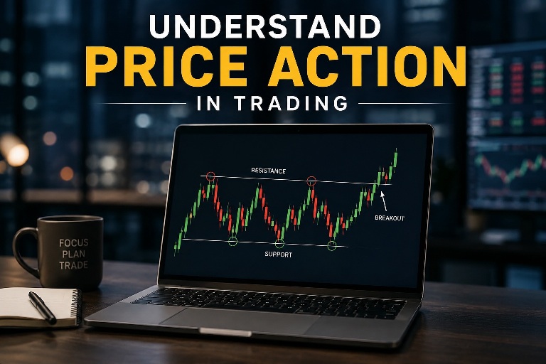
Understanding Price Action
in Trading
Most traders drown in indicators. Price action cuts through the noise — it teaches you to read the market itself, not a lagging version of it. This is the complete guide you need.
What Is Price Action Trading?
Let’s start simple. Price action is the study of how a market’s price moves over time — without layering technical indicators on top. Instead of asking “what does the RSI say?” a price action trader asks “what is this chart actually telling me right now?”
Think of it like learning to read a room. You can install sensors to measure the noise level, the temperature, and the lighting — or you can walk in and just… observe. Price action is that observation. The raw candlesticks, the highs and lows, the speed of moves, the pauses and reversals — these all carry information that indicators often dilute or delay.
The method gained massive traction because it works across all markets — stocks, forex, crypto, commodities — and across every timeframe. Whether you’re a scalper staring at a 1-minute chart or a swing trader reviewing weekly candles, the same principles apply. That universality is part of what makes it so valuable to learn properly.
Why Price Action Beats Pure Indicator Reliance
Here’s something most beginners discover the hard way: indicators are derived from price. The MACD is a moving average of moving averages. RSI measures the ratio of recent gains to recent losses. Bollinger Bands are standard deviations of a moving average. Every single one of them is built from price data — which means price itself is always first.
When you rely entirely on indicators, you’re reading a translation of a translation. Price action skips the middleman. You get the original signal before it’s processed, smoothed, and inevitably lagged.
“The market is always right. Your job isn’t to argue with it — it’s to understand what it’s saying.”
— A principle repeated by serious traders across every market
That said, price action is not about rejecting all tools. Many professional traders combine price action with volume or a single moving average for trend context. The key is understanding why price is moving before trusting any signal. Indicators can confirm what price already told you — they shouldn’t replace the ability to read the chart itself.
Reading Candlesticks — The Language of Price
If price action is a language, candlesticks are its alphabet. Every candle tells a story — it shows you where price opened, where it closed, and how far it traveled in between. Spend time really learning what a candle represents and everything else clicks into place faster.
Anatomy of a Single Candle
Each candlestick covers a specific time period — one minute, one hour, one day, whatever your chart timeframe is. The body (the thick part) shows the open and close. The wicks (thin lines above and below) show the high and low during that period.
A green (bullish) candle closed higher than it opened. A red (bearish) candle closed lower than it opened. Simple enough — but the size of the body and the length of the wicks tell a much deeper story about who was in control during that session.
The Most Important Candlestick Signals
You don’t need to memorize 50 candlestick patterns. These handful do the heavy lifting in real trading:
Small body, long lower wick. Buyers pushed back hard against a sell-off — often signals a bullish reversal.
Open and close nearly equal. The market is in equilibrium — a pause or indecision that often precedes a move.
A large candle completely swallows the previous one. Bullish or bearish depending on direction — very reliable.
Long wick, tiny body. Shows strong rejection from a price level — one of the highest-probability setups in price action.
Three-candle reversal pattern at market bottoms — bearish candle, indecision, then strong bullish recovery.
The bearish mirror of the Morning Star. Signals exhaustion at the top — sellers take control on the third candle.
Support and Resistance — The Map of the Market
If candlesticks are the language, support and resistance are the grammar. These are the price zones where buying or selling pressure has historically been strong enough to stop or reverse a move. Once you train your eye to see them, you start understanding why prices behave the way they do at certain levels.
What Makes a Level Strong?
Not all support and resistance zones are equal. The strength of a level depends on a few factors that are worth internalizing early:
- How many times price has reacted at that level (more = stronger)
- How long ago the level was formed (older levels that still hold are significant)
- How sharp the reversal was when price first hit that zone
- Round numbers like $100, $1.2000 in forex, or $50,000 in crypto — psychology creates supply and demand at clean numbers
Support Becomes Resistance (and Vice Versa)
This is one of those concepts that seems simple but unlocks a lot of trades. When price breaks below a support level, that same level often acts as resistance on a pullback. The buyers who were defending that zone are now trapped — and when price comes back to that level, they tend to exit their losing positions, creating selling pressure.
Traders call this “role reversal” and it’s one of the most reliable phenomena in all of technical analysis. Every time you see a clean break of a key level, start watching for price to return to it — that’s often where the next setup lives.
Identifying Trends — The Single Most Important Skill
There’s a saying that nearly every experienced trader agrees on: the trend is your friend. It sounds cliché because it’s true. Trading with the trend dramatically improves your probability — you’re aligning with the dominant flow of money in the market rather than fighting it.
The Classic Definition
Price action defines a trend through the structure of its highs and lows. An uptrend is a sequence of higher highs (HH) and higher lows (HL) — price is making new peaks and each pullback stops above the previous one. A downtrend is the opposite: lower highs (LH) and lower lows (LL) form a staircase downward.
When this structure breaks — when an uptrend fails to make a new higher high, or a pullback goes below the previous higher low — you have your first sign that the trend may be weakening. That’s not a reversal signal on its own, but it’s a yellow flag worth watching.
Recognizing Range-Bound Markets
Not every market is trending. A significant portion of trading time is spent in consolidation — price bouncing between a defined ceiling and floor without making significant directional progress. In these conditions, the playbook shifts: instead of following breakouts, you’re fading moves toward the edges of the range and waiting for a genuine breakout to signal the next trend.
Key Price Action Patterns That Actually Work
Beyond individual candles, price action traders look for multi-candle patterns and structural formations that signal where price is likely to go next. These aren’t magic — they work because they reflect human psychology repeating itself across different markets and time periods.
Inside Bar
An inside bar is a candle whose high and low are completely within the range of the previous candle (the “mother bar”). It signals consolidation and compressed volatility — and a breakout of the mother bar’s range often leads to a sharp move. It’s one of the cleanest and most versatile price action setups you can trade.
Fakey Setup (False Breakout)
The market breaks out of a consolidation range, entices breakout traders in, and then reverses sharply. This “fake” breakout traps traders on the wrong side, and the resulting squeeze fuels the move in the opposite direction. Professional traders love this setup precisely because it systematically harvests the stops of less experienced participants.
Two-Bar Reversal
Two consecutive opposing candles of roughly equal size — the first is bullish, the second is bearish (or vice versa). Clean and simple, it shows a direct battle between bulls and bears where one side completely overpowered the other within two bars. At key levels, this carries strong predictive weight.
Price Action Confluence
The single most powerful concept in this entire guide. Confluence means multiple factors aligning at the same level — for example, a pin bar forming at a support level that also aligns with a previous swing high and a round number. Any single factor alone is weak; three factors agreeing is a genuinely high-probability setup. Train yourself to always ask: “what else is happening at this level?”
Entries, Stop Losses, and Exits
A pattern without an execution plan is just a picture. The difference between a trader who breaks even and one who consistently profits often comes down to how they enter, where they place their stop, and when they exit. Let’s break each one down practically.
-
1Wait for Confirmation Don’t enter the moment you see a potential pattern. Wait for the candle to close. A pin bar isn’t a pin bar until the session closes with that long wick intact. Entering mid-candle is one of the fastest ways to get faked out repeatedly.
-
2Place Your Stop Beyond the Setup Your stop loss should go beyond the high or low of the signal candle — at a level where, if reached, your trade idea is clearly wrong. If a pin bar is your entry, the stop goes just beyond the wick’s extreme. This removes ambiguity.
-
3Define Your Target Before Entering Know your reward-to-risk ratio before you click buy or sell. A minimum of 1.5:1 (risk $1 to make $1.50) is a reasonable floor. Many experienced traders hold out for 2:1 or better on their setups. The math of trading only works if winners are bigger than losers.
-
4Manage the Trade — Don’t Micromanage It Once in a trade, your job is to let it work. Moving your stop loss tighter prematurely out of nervousness is one of the most common profitability killers. Set it, leave it, and let price action tell you when the situation has changed.
-
5Exit at Structure, Not at Emotions Take profit near the next significant support or resistance level — the place where price is most likely to stall or reverse. “Letting winners run” is wise only when structure supports it. When price reaches a major level, don’t be greedy: respect the map.
Multi-Timeframe Analysis
One of the most powerful things you can do is stop looking at a single chart in isolation. Professional traders routinely check at least two — often three — timeframes before making a decision. The logic is straightforward: a signal on a 15-minute chart is much stronger when the daily chart is also pointing in the same direction.
| Timeframe | Primary Use | Best For | Signal Weight |
|---|---|---|---|
| Weekly / Monthly | Big picture bias | Identifying major S&R zones | Highest |
| Daily | Trend direction | Swing trade setups | High |
| 4-Hour | Entry timing | Refining swing entries | Medium-High |
| 1-Hour | Pattern formation | Day trade setups | Medium |
| 15-Min / 5-Min | Precise entry | Fine-tuning stops & entries | Lower (standalone) |
The workflow most traders follow is called top-down analysis: start on the highest relevant timeframe to establish the overall bias, then drop down to find the actual trade setup. A bullish setup on the 1-hour chart means far more when the daily trend is also bullish and price is near a weekly support level.
Common Price Action Mistakes (And How to Avoid Them)
Every trader makes these errors at some point. Knowing them in advance doesn’t make you immune, but it does make you faster at recognizing and correcting them.
Frequently Asked Questions
Ready to Read Charts Like a Pro?
uCharts gives you clean, professional-grade charting tools built specifically for active traders. No clutter. No guesswork. Just the market, clearly presented.
Start Charting Free Explore the Dashboard