Best Way to Analyze Stocks Using Trading Charts and Indicators
Every serious trader eventually asks the same question: what is actually the best way to analyze stocks using trading charts and indicators? The honest answer is that there is no single magic formula. Instead, consistent results come from combining a few reliable chart-reading skills with a small, well-understood set of indicators — and applying them the same way, trade after trade. This guide walks through exactly how to do that, step by step, so you can build a repeatable process instead of guessing.
Whether you are looking at a large-cap tech stock or a smaller growth name, the underlying logic of chart analysis stays the same. Price reflects the combined decisions of every buyer and seller, and charts are simply a visual record of that ongoing negotiation. Once you learn to read that record properly, indicators stop feeling like magic signals and start acting as confirmation tools that support decisions you can already see forming on the chart.
Why Chart Analysis Matters for Stock Traders
Fundamental analysis tells you whether a company is healthy. Chart analysis tells you when the market is actually willing to pay up for that health — or punish it. Prices can stay disconnected from fundamentals for long stretches, which is why traders who only study balance sheets often mistime their entries and exits. Reading a chart correctly helps you see supply and demand in real time, rather than relying on lagging quarterly reports.
If you want a deeper comparison of these two approaches before going further, our guide on technical vs fundamental analysis breaks down exactly when each method is more useful.
Understanding the Basic Chart Types
Before touching a single indicator, it is worth mastering the three chart types most traders actually use. Each one presents the same price data differently, and the type you choose affects how quickly you can spot patterns.
Line Charts
A line chart connects closing prices over time. It is the simplest way to see the overall direction of a stock, and it is especially useful when you want to strip away noise and just study the trend.
Bar Charts
Bar charts show the open, high, low, and close (OHLC) for each period. They give more detail than a line chart but can be harder to read quickly at a glance, especially across many periods at once.
Candlestick Charts
Candlestick charts are the industry standard for a reason. Each candle visually represents the battle between buyers and sellers within a given time frame, with the body showing the open-to-close range and the wicks showing the extremes. Once you learn to recognize a handful of candlestick patterns — like dojis, engulfing candles, and hammers — you gain a much faster read on market sentiment than raw numbers alone can offer.
Step 1: Identify the Trend Before Anything Else
The single biggest mistake new traders make is jumping straight to indicators without first asking a basic question: is this stock in an uptrend, downtrend, or trading sideways? Every indicator behaves differently depending on the answer.
- Uptrend: a series of higher highs and higher lows. Buyers are consistently stepping in on dips.
- Downtrend: a series of lower highs and lower lows. Sellers control most rallies.
- Sideways/range-bound: price oscillates between a relatively fixed ceiling and floor, with no clear directional bias.
Trend identification alone will filter out a huge number of bad trades. Momentum indicators, for example, are far more reliable in a trending market than in a choppy, range-bound one, so knowing the environment first changes how much weight you give any signal that follows.
Step 2: Mark Support and Resistance Zones
Support and resistance are the price levels where a stock has repeatedly reversed or paused in the past. These zones represent areas where a meaningful number of buyers or sellers previously stepped in, and they tend to matter again in the future because traders collectively remember them.
Rather than drawing a single precise line, treat support and resistance as zones a few percentage points wide. Price rarely reverses at an exact number — it reacts within a general area. Combining these zones with candlestick patterns at the point of contact (such as a hammer forming right at support) gives a much higher-confidence signal than either tool used alone.
Step 3: Layer in Trading Indicators
Once trend direction and key price zones are mapped out, indicators become genuinely useful — not as standalone signals, but as confirmation tools. Below are the indicators most professional and retail traders rely on, along with what each one is actually good at.
Moving Averages
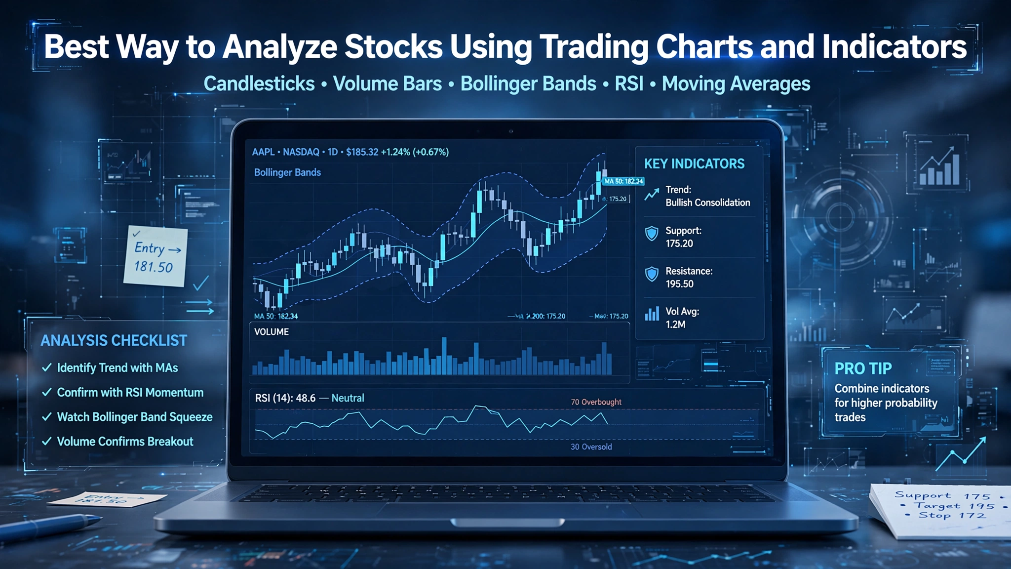
Moving averages smooth out price data to show the underlying direction more clearly. The 50-day and 200-day simple moving averages are widely watched; when the shorter average crosses above the longer one, it is often called a “golden cross” and is read as a bullish signal, while the opposite is called a “death cross.”
Relative Strength Index (RSI)
RSI measures the speed and size of recent price moves on a scale of 0 to 100. Readings above 70 generally suggest a stock is overbought, while readings below 30 suggest it may be oversold. RSI works best in range-bound markets and should be interpreted cautiously during strong trends, where a stock can stay “overbought” for a long stretch while still climbing.
MACD (Moving Average Convergence Divergence)
MACD tracks the relationship between two moving averages and is particularly good at spotting shifts in momentum before they show up clearly in price. A MACD line crossing above its signal line is typically read as bullish momentum building, and vice versa.
Volume
Volume is often overlooked, but it may be the single most honest indicator on any chart. A price move on high volume carries far more conviction than the same move on thin volume. Watch for volume spikes at breakout points — they confirm that real participation is behind the move rather than a handful of low-liquidity trades.
| Indicator | Best Used For | Watch Out For |
|---|---|---|
| Moving Averages | Confirming overall trend direction | Lag during fast reversals |
| RSI | Spotting overbought/oversold conditions | Unreliable in strong trends |
| MACD | Catching early momentum shifts | False signals in choppy markets |
| Volume | Confirming breakout strength | Can spike on news unrelated to trend |
Step 4: Avoid the Common Trap — Indicator Overload
It is tempting to stack five or six indicators on a single chart, hoping that more tools mean more accuracy. In practice, the opposite usually happens. Many popular indicators are mathematically derived from the same price data, so stacking several similar ones just repeats the same signal in different colors while making the chart harder to read.
A cleaner approach is to pick one trend indicator (like a moving average), one momentum indicator (like RSI or MACD), and volume — then master how those three interact across dozens of chart examples before adding anything else.
Step 5: Combine Timeframes for Better Context
Looking at a single timeframe in isolation can be misleading. A stock might look bullish on a daily chart while sitting inside a longer-term downtrend on the weekly chart. Multi-timeframe analysis means checking the bigger picture first (weekly or monthly) to understand the dominant trend, then zooming into a shorter timeframe (daily or 4-hour) to fine-tune entries and exits within that broader context.
Step 6: Manage Risk Before You Manage Profit
Even a perfect chart read is worthless without proper position sizing and risk control. Before entering any trade, decide your stop-loss level, your target, and how much capital you are willing to risk on that single position. This is where a dedicated position size calculator becomes useful — it removes the guesswork and keeps your risk per trade consistent, regardless of how confident you feel about a particular setup.
Putting It All Together: A Simple Analysis Workflow
- Check the higher timeframe to identify the dominant trend.
- Mark key support and resistance zones on the chart.
- Apply one trend indicator and one momentum indicator for confirmation.
- Confirm any breakout or reversal with volume.
- Set stop-loss and position size before entering the trade.
- Review the trade afterward regardless of outcome, and note what the chart actually told you versus what you expected.
This workflow is deliberately simple. Professional traders are not usually the ones using the most indicators — they are the ones applying a small, well-tested set of tools consistently, across hundreds of repetitions, until pattern recognition becomes second nature.
How External Research Fits In
Charts tell you what the market is doing, but understanding why certain patterns tend to repeat comes from studying established technical analysis theory. Resources like Investopedia’s overview of technical analysis are a solid starting point for understanding the theoretical foundations behind indicators, while broader market-structure context is available through public resources such as the U.S. Securities and Exchange Commission’s investor education site, which covers how markets are structured and regulated.
Frequently Asked Questions
What is the single best indicator for analyzing stocks?
There isn’t one universally “best” indicator — each measures something different. Moving averages show trend, RSI and MACD show momentum, and volume shows conviction. The strongest analysis comes from combining a small set of complementary indicators rather than relying on just one.
How many indicators should I use on one chart?
Two to three is usually enough: one trend indicator, one momentum indicator, and volume. Beyond that, most additional indicators start repeating the same underlying signal.
Can chart analysis work without any indicators at all?
Yes. Many experienced traders rely primarily on price action, support and resistance, and volume, using indicators only as secondary confirmation rather than as primary signals.
Is technical analysis reliable for long-term investors?
It is more commonly used by short and medium-term traders, but long-term investors can still use charts to time entries into positions they have already selected using fundamental analysis.
Final Thoughts
The best way to analyze stocks using trading charts and indicators is not about finding a secret formula — it is about building a consistent, repeatable process: read the trend first, mark meaningful price zones, layer in a small set of trusted indicators, confirm with volume, and always manage risk before chasing profit. Master that sequence across enough real chart examples, and indicator signals stop feeling random and start becoming genuinely useful confirmation tools within a bigger picture you already understand.
This article is for educational purposes only and does not constitute financial or investment advice. Trading and investing involve risk, including the potential loss of capital. UCharts.org is an independent education and review resource and is not a broker.