What Is a Stock Chart and How Does It Work?
A clear, beginner-friendly breakdown of what a stock chart actually shows and how to start reading one with confidence.
If you have ever glanced at a financial news channel or a trading app, you have almost certainly seen a stock chart — a zig-zagging line or a wall of colored bars moving across the screen. To an experienced trader, that chart is packed with useful information. To a beginner, it can look like meaningless noise. This guide breaks down exactly what a stock chart is, what each part of it represents, and how it works so that you can start reading one with real understanding.
By the end of this article, you’ll know how price and volume are plotted, the difference between the main chart types, and how to start applying this knowledge the next time you open a live chart.
What Exactly Is a Stock Chart?
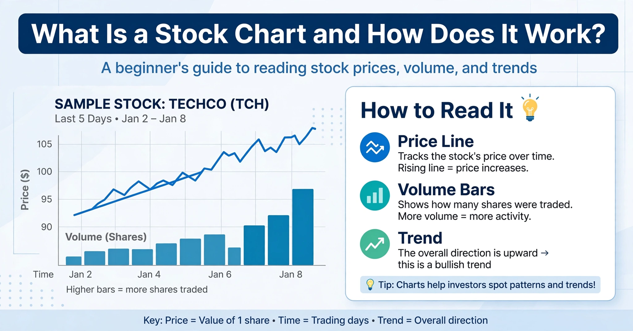
A stock chart is a visual record of how a company’s share price has moved over a specific period of time. Instead of scrolling through pages of raw numbers, a chart lets you instantly see whether a stock has been rising, falling, or moving sideways, and how volatile that movement has been. Every point plotted on the chart corresponds to a real transaction — or a summary of many transactions — that took place in the market.
Stock charts aren’t just for professional traders. Long-term investors use them to time entries, spot major trend shifts, and understand how a stock has historically reacted to earnings reports or broader market conditions. Short-term traders use the same charts, just on faster timeframes, to make quicker decisions.
The Core Elements of Every Stock Chart
No matter which chart type you’re looking at, almost every stock chart is built from the same basic components.
| Element | What It Shows |
|---|---|
| Price Axis (vertical) | Represents the stock’s price level, usually shown on the right-hand side of the chart. |
| Time Axis (horizontal) | Represents the passage of time, from seconds and minutes up to years, depending on the chosen timeframe. |
| Price Plot | The line, bar, or candlestick shapes that show how price has moved across each time interval. |
| Volume Bars | Usually shown below the main chart, indicating how many shares were traded during each period. |
| Indicators (optional) | Overlays such as moving averages, RSI, or Bollinger Bands that traders add for extra context. |
Types of Stock Charts
There are several ways to visualize the same underlying price data. Each chart type presents the information slightly differently, which changes how much detail you can extract at a glance.
Line Chart
A line chart connects the closing price of each period with a single continuous line. It’s the simplest chart type and is great for spotting the overall trend at a glance, but it hides a lot of detail — you can’t see the opening price, the high, or the low of each period.
Bar Chart (OHLC)
An OHLC bar chart uses a vertical line for each period, with small horizontal ticks on the left (showing the open) and right (showing the close). The top and bottom of the vertical line represent the high and low. It packs in more information than a line chart, but it takes practice to read quickly.
Candlestick Chart
A candlestick chart plots the same open, high, low, and close data as a bar chart, but wraps the open-to-close range in a colored “body,” with thin wicks showing the high and low. Because the colors make it easy to instantly see whether buyers or sellers were in control, candlestick charts have become the default choice for most modern trading platforms.
Point and Figure Chart
A less common chart type that ignores time entirely and only plots significant price moves using columns of X’s and O’s. It’s mainly used by traders who want to filter out minor price noise and focus purely on major directional shifts.
Understanding OHLC Data: Open, High, Low, Close
Almost every stock chart, regardless of style, is built from four core data points for each time period:
- Open: The price at which the stock started trading at the beginning of that period.
- High: The highest price reached at any point during that period.
- Low: The lowest price reached at any point during that period.
- Close: The price at which the stock finished trading at the end of that period.
These four values, often abbreviated as OHLC, form the backbone of virtually all technical chart types. Once you understand how these four numbers are captured and plotted, every chart style — line, bar, or candlestick — starts to make a lot more sense, because they’re all just different visual ways of presenting the same underlying data.
Timeframes: Choosing the Right Chart Interval
A stock chart can be displayed across almost any timeframe — from 1-minute intervals used by day traders, up to weekly or monthly intervals used by long-term investors. Each candle, bar, or point on the line represents one full time interval of trading activity.
Shorter timeframes show more granular detail but also more “noise” — small, often meaningless price fluctuations. Longer timeframes smooth out that noise and make it easier to see the bigger picture, but they update far less frequently. Many traders use a combination of timeframes: checking the weekly or daily chart to understand the broader trend, then zooming into an hourly or 15-minute chart to fine-tune entry and exit points.
Reading Volume on a Stock Chart
Volume, usually displayed as a series of vertical bars underneath the main price chart, shows how many shares were traded during each period. Volume is one of the most underrated tools available to chart readers, because it tells you how much conviction is behind a price move.
A large price move on high volume suggests strong, broad participation and is generally considered more meaningful than the same price move happening on unusually low volume, which might just reflect a handful of trades moving a thinly traded stock. Watching volume alongside price is one of the simplest ways to separate genuine trend shifts from short-lived noise.
Trend Lines, Support, and Resistance
Once you’re comfortable reading the basic chart shape, the next layer of analysis involves drawing trend lines and identifying support and resistance zones directly on the chart.
- Trend Line: A straight line connecting a series of higher lows (in an uptrend) or lower highs (in a downtrend), used to visualize the general direction of price.
- Support: A price level where a stock has historically stopped falling and bounced back up, as buyers step in.
- Resistance: A price level where a stock has historically stopped rising and pulled back, as sellers step in.
These simple concepts form the foundation for almost every other form of technical analysis, including candlestick pattern recognition and indicator-based strategies.
How Stock Charts Reflect Market Psychology
A stock chart isn’t just a record of numbers — it’s a visual representation of collective human behavior. Every peak represents a moment when optimism or greed pushed buyers to pay higher prices. Every trough represents a moment when fear or panic pushed sellers to accept lower ones. Recurring patterns on a chart tend to repeat because human psychology, in aggregate, tends to repeat as well.
This is exactly why chart reading has remained relevant for well over a century, even as the tools used to generate these charts have evolved from hand-drawn ledgers to real-time digital platforms.
Stock Charts vs Fundamental Data
| Stock Chart Analysis (Technical) | Fundamental Analysis |
|---|---|
| Focuses on price, volume, and historical patterns | Focuses on revenue, earnings, and company financial health |
| Best for timing entries and exits | Best for evaluating long-term company value |
| Reacts to market sentiment and behavior | Reacts to business performance and economic data |
Most experienced investors don’t treat these two approaches as competitors. Instead, they use fundamental analysis to decide what to buy and chart analysis to help decide when to buy it. If you want a deeper comparison of these two schools of thought, our detailed breakdown of Technical vs Fundamental Analysis Explained Clearly is a great next read.
How to Start Reading Stock Charts as a Beginner
Getting comfortable with stock charts doesn’t require a finance degree — it just takes a structured approach and consistent practice. Here’s a simple path to follow:
- Start with a daily timeframe on a well-known, liquid stock so the price action is cleaner and more representative.
- Learn to identify the current trend before anything else — is the stock generally moving up, down, or sideways?
- Add volume to your chart and get used to comparing price moves against the volume behind them.
- Draw basic support and resistance levels using recent highs and lows.
- Gradually introduce one or two indicators, such as a moving average, rather than cluttering the chart with too many tools at once.
To see how institutional traders and large funds approach this same process at scale, our guide on how institutional investors analyze the stock market offers useful context on how professional-grade chart reading actually works in practice. And once you’re ready to plan real trade sizes responsibly, the Position Size Calculator can help you translate your chart-based decisions into properly sized, risk-managed trades.
Common Mistakes New Chart Readers Make
- Overloading the chart with indicators: Too many overlapping tools can create conflicting signals and analysis paralysis. Start simple.
- Ignoring the broader trend: A short-term pattern that goes against the dominant trend is generally less reliable than one that aligns with it.
- Skipping volume entirely: Price moves without volume confirmation are often less trustworthy than they appear.
- Switching timeframes too often: Jumping between timeframes constantly can make a clear trend look confusing. Pick a primary timeframe and stick with it.
- Treating charts as a crystal ball: Charts show probability, not certainty. Risk management still matters, no matter how clear a pattern looks.
For additional, research-backed explanations of how markets and price charts function, the investor education materials published by the U.S. Securities and Exchange Commission’s Investor.gov and the finance and markets lessons on Khan Academy are excellent free resources to build a stronger foundation.
Frequently Asked Questions
Do I need to pay for a charting platform to get started?
No. Most modern trading apps and brokers provide free, real-time or near-real-time charting tools that are more than enough for beginners to start learning. Paid platforms typically add extra indicators, faster data feeds, or advanced drawing tools that become more useful as you gain experience.
Which chart type is best for beginners?
Most beginners find candlestick charts the easiest to work with because the color-coded bodies make it instantly clear whether buyers or sellers were in control during each period, without needing to interpret thin bar-chart ticks.
Can stock charts predict future prices?
Not with certainty. Charts reflect historical price behavior and current sentiment, which can help estimate probabilities, but they cannot guarantee future outcomes. That’s why risk management remains essential no matter how confident a chart pattern looks.
Final Thoughts
A stock chart is simply a visual translation of price and volume data over time, built from four core numbers — open, high, low, and close — that get plotted using different chart styles depending on your preference. Once you understand how these building blocks work, reading a chart stops feeling like decoding a foreign language and starts feeling like reading a familiar story about buyers, sellers, and shifting sentiment.
Start with the basics covered in this guide, practice on a clean daily chart, and gradually layer in trend lines, volume analysis, and simple indicators as your confidence grows.